
[School project] Career Connect Web-app for UofT Students
OVERVIEW
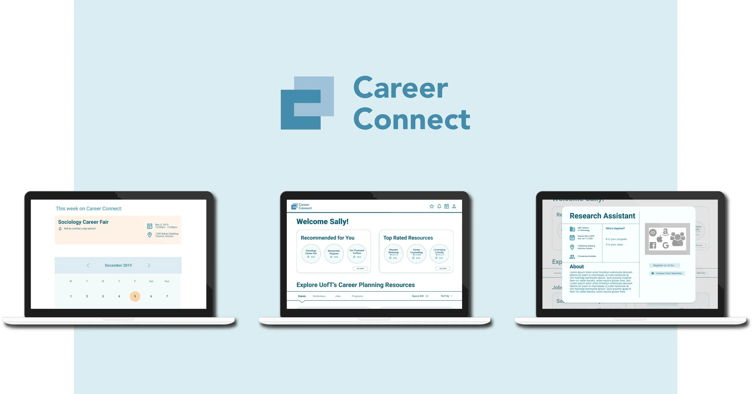
With a purpose to help the Innovation Hub solving issues that University of Toronto students are facing, this project dived deep into undergrads’ career concerns. Career Connect is a web-app designed to tackle this issue, and assist students to perform their career planning in a more convenient, motivated, and timely fashion.
PARAMETERS
Tasks:
UX research & design
Marketing film production
My role:
User research, user analysis (quant/qual), persona, empathy mapping, ideation, sketching, wireframing, prototyping, usability testing.
Time & Location:
Oct. 2019 - Dec. 2019
INF1602 Essentials of UXD, iSchool, University of Toronto
Skills:
Figma, Balsamiq, Adobe Illustrator
TRAILER
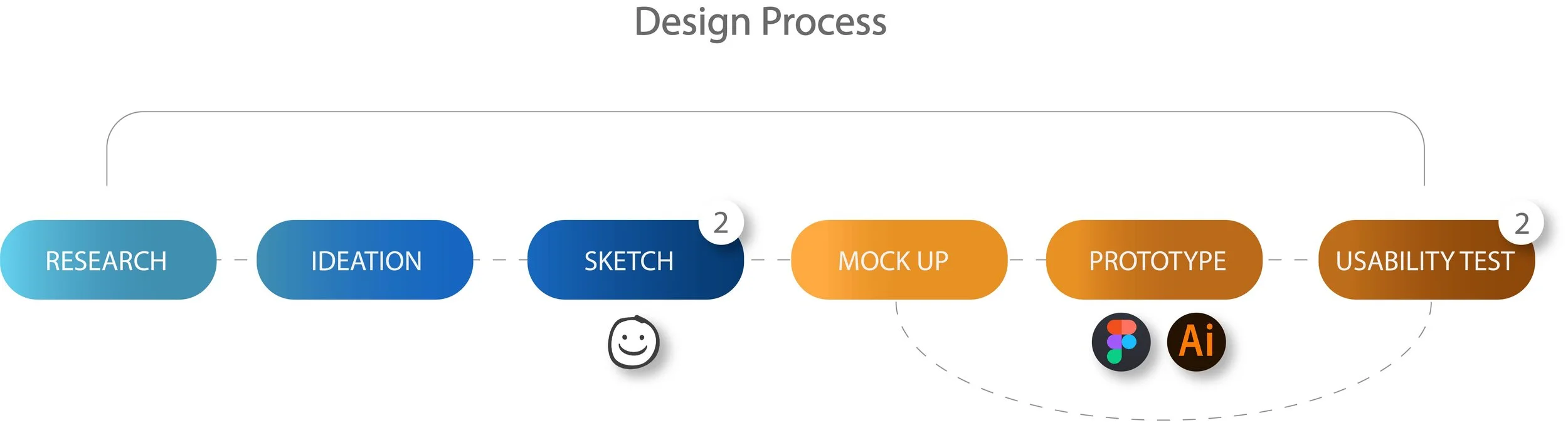
DESIGN PROCESS
RESEARCH
The researches seek to investigate:
actualities of career planning in college students’ lives
how UofT students (both grads and undergrads) feel about career planning and all career relevant resources available on campus
Research methods:
Online field research
Crowdsourcing on Google Survey
Academic research
On-site semi-structured interview
Participants:
10 undergrads + grads found on campus, 61 participants of Google survey
Reason why we also engaged graduate students is because they’ve been through the experience of career planning at UofT therefore can contribute opinions from a consequential point of view.
THE CHALLENGE
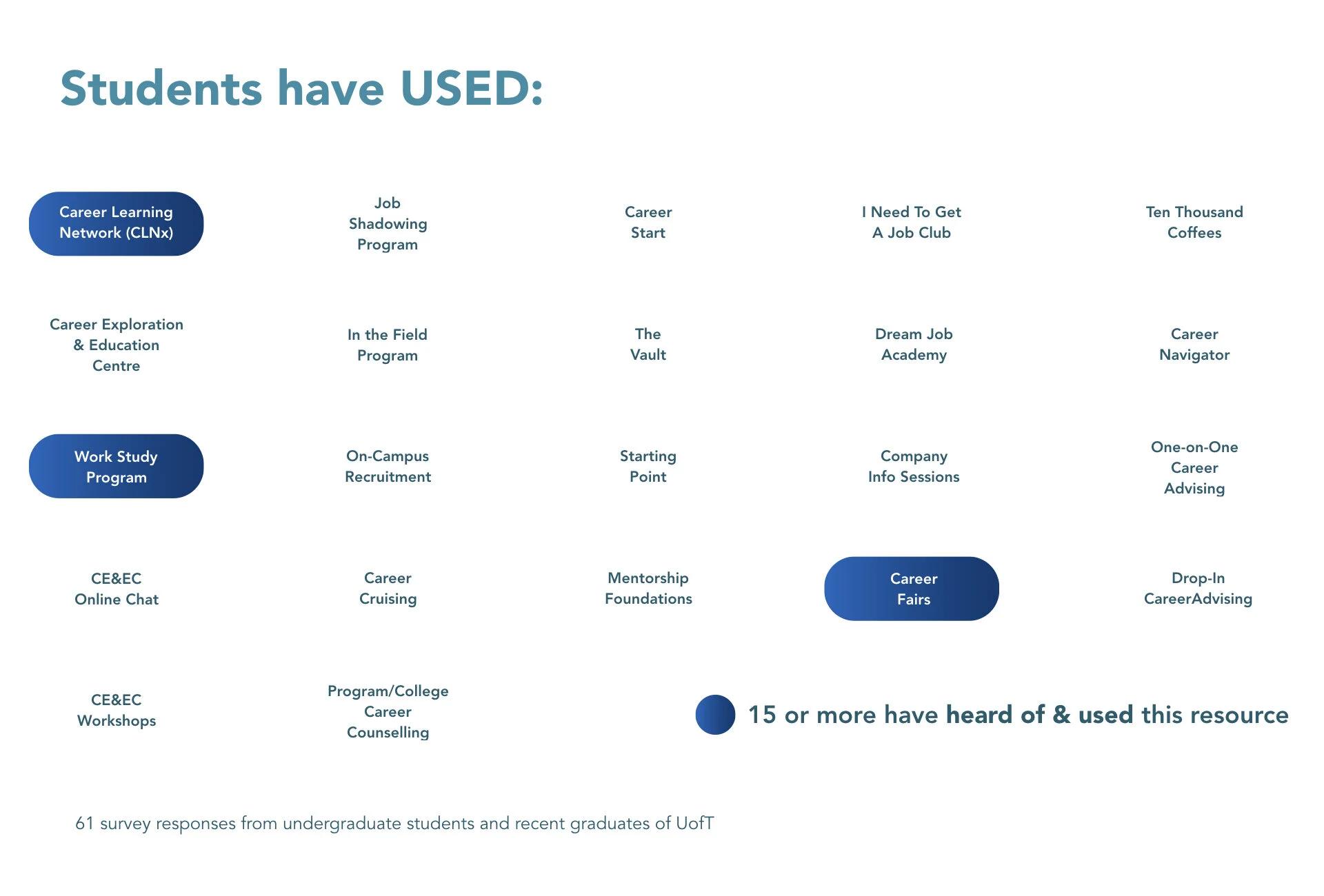
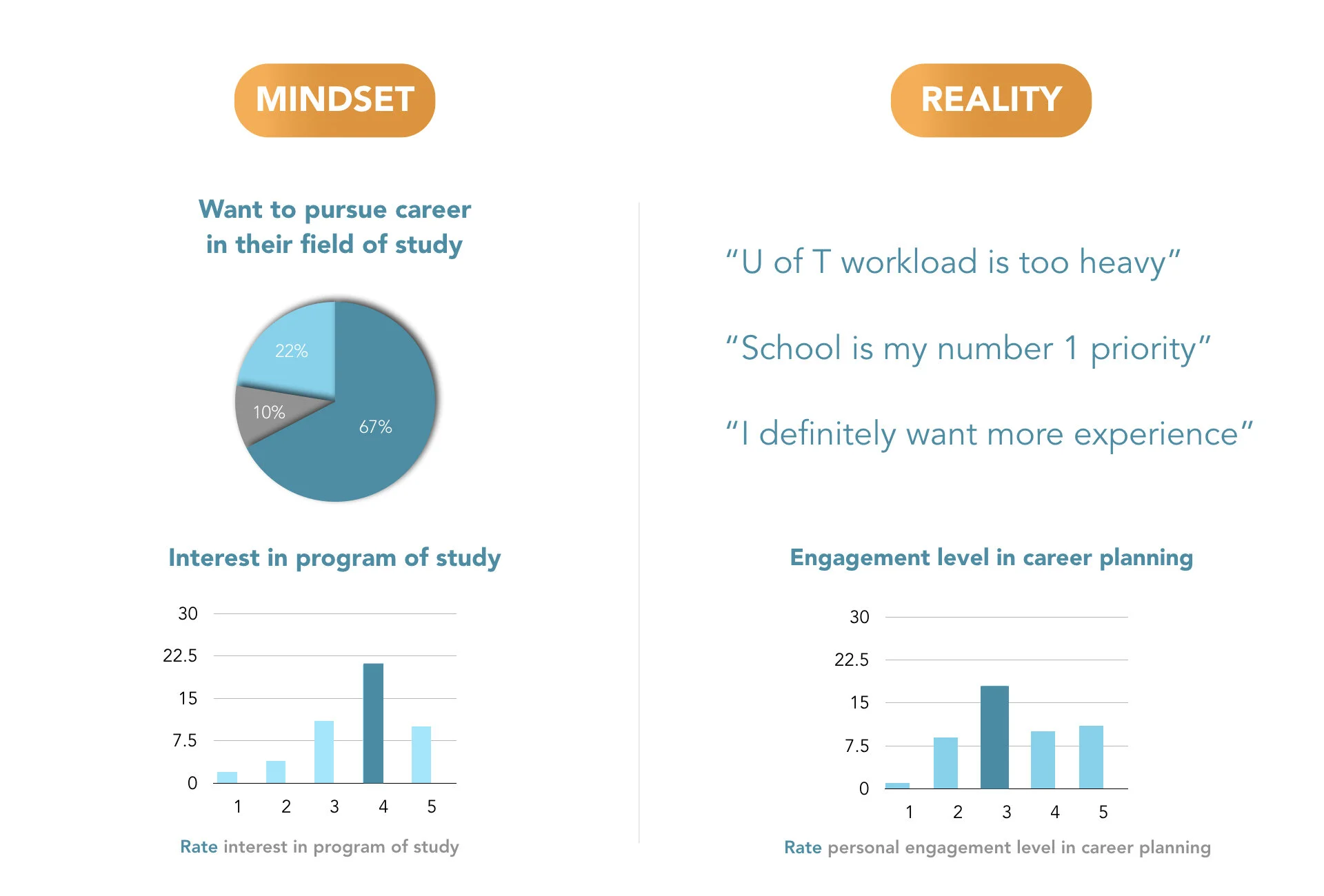
1. Lack of Awareness of available resources on campus
2. Information Overload
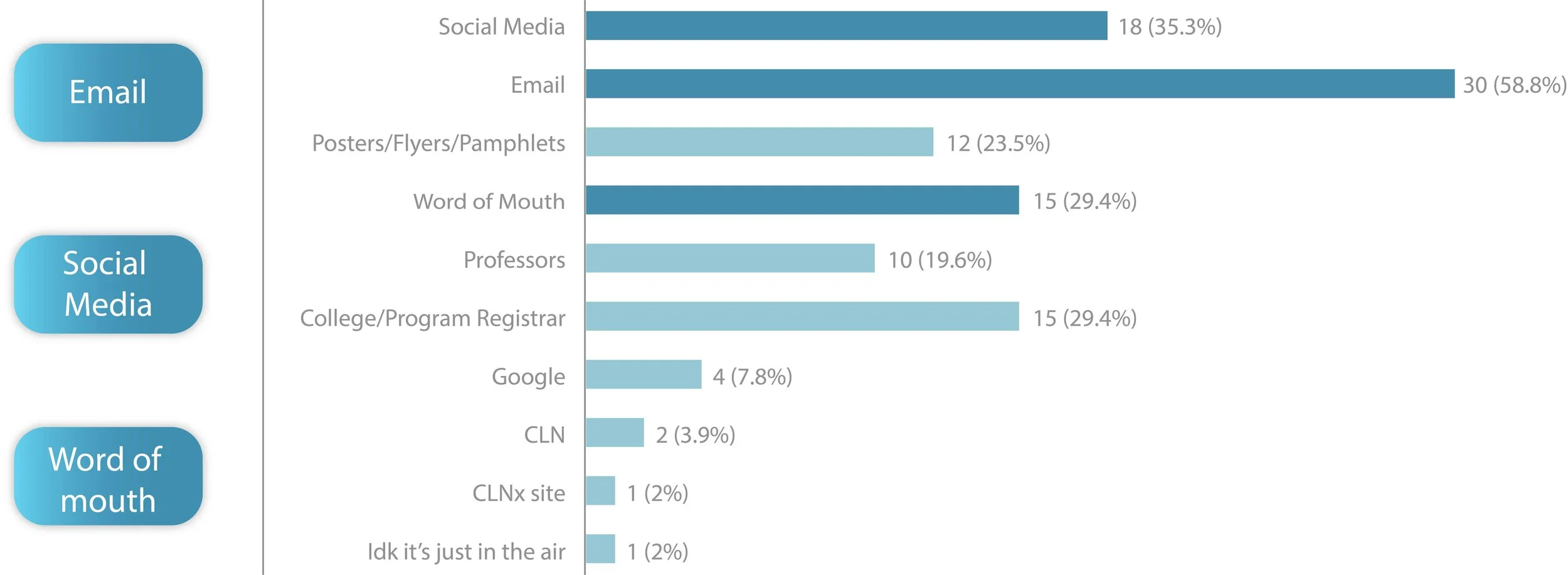
3. Busy Schedules
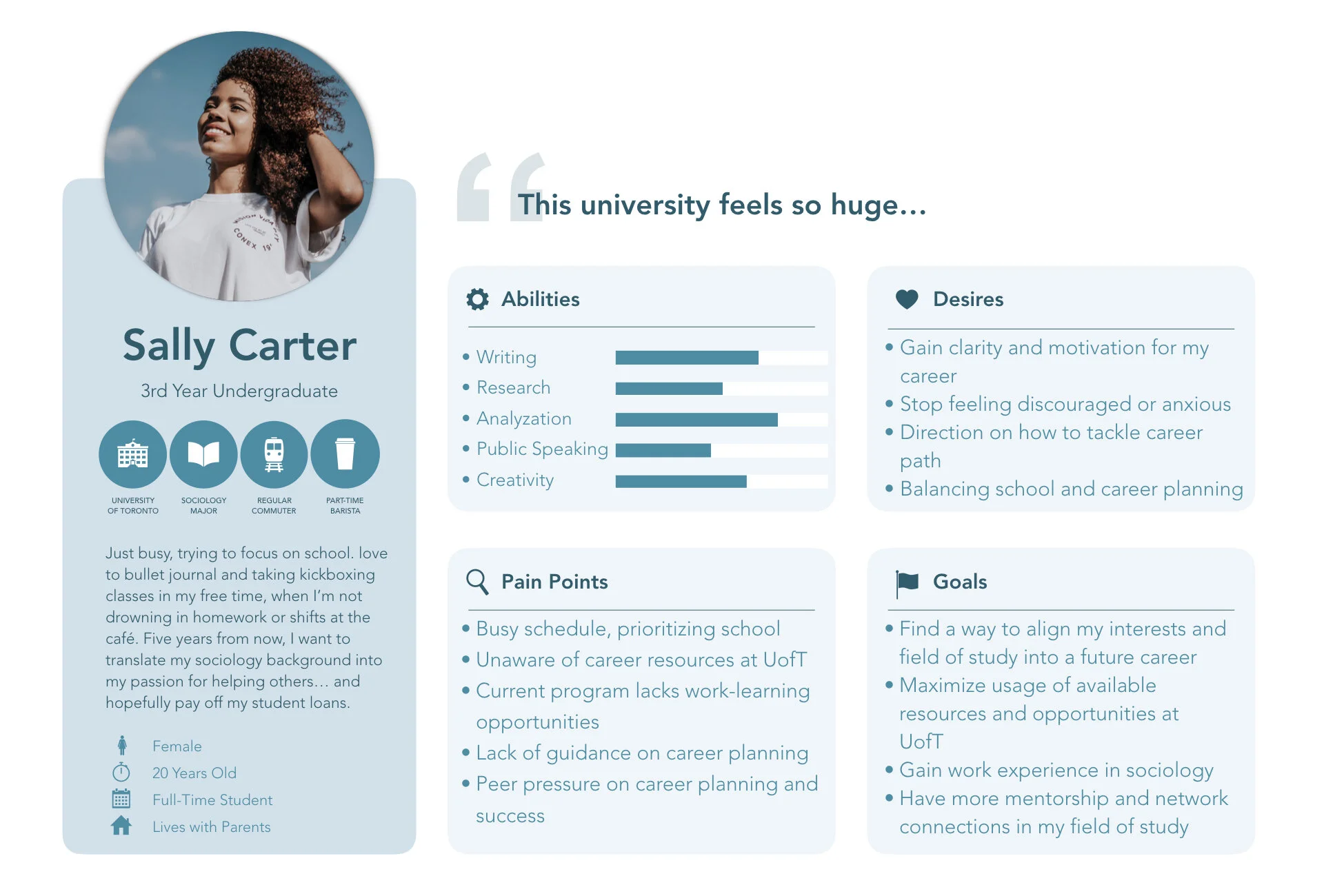
PERSONA: SALLY
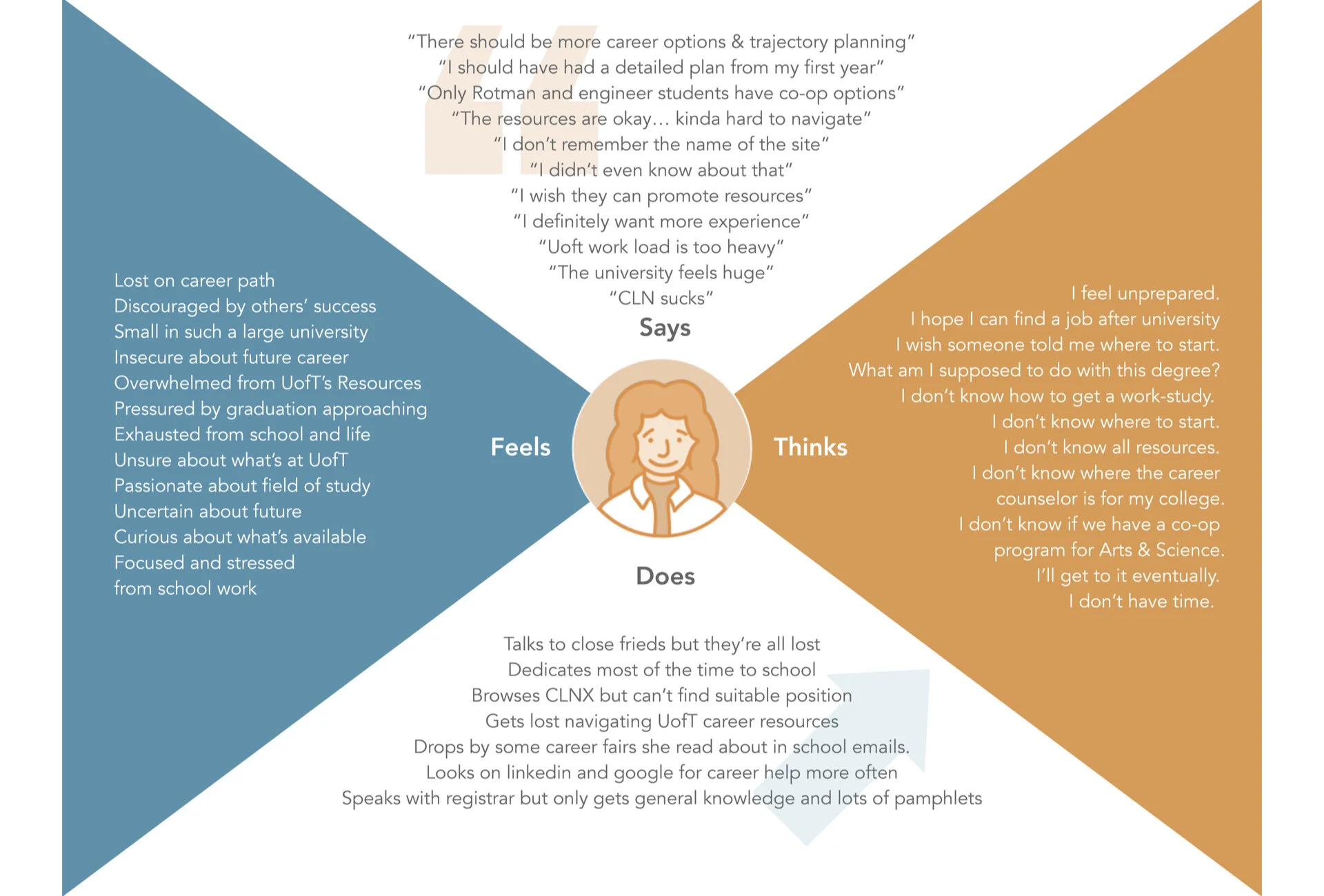
Persona & empathy map
IDEATION
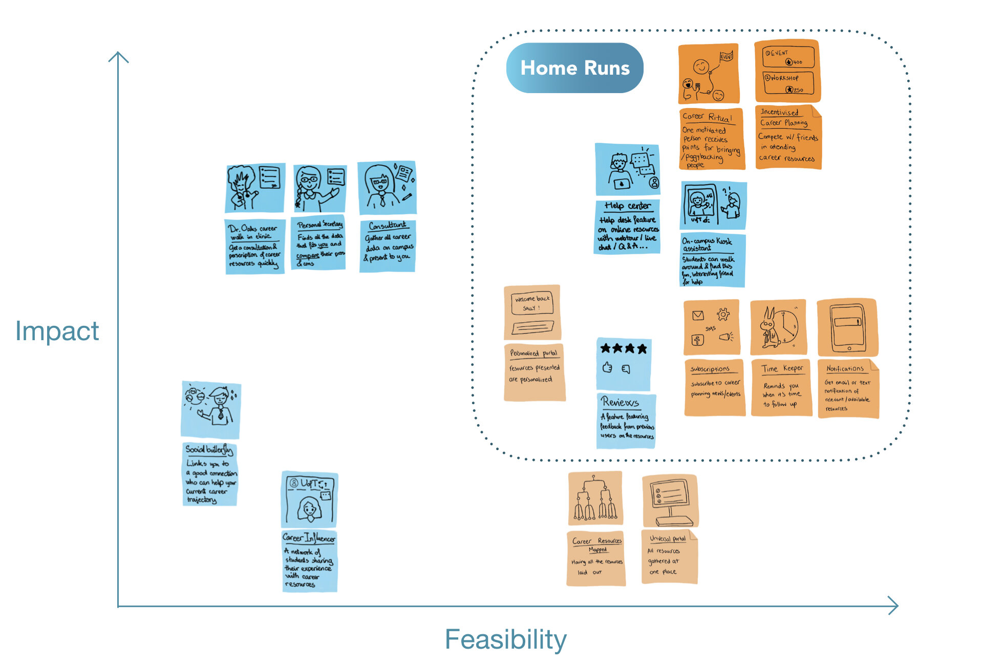
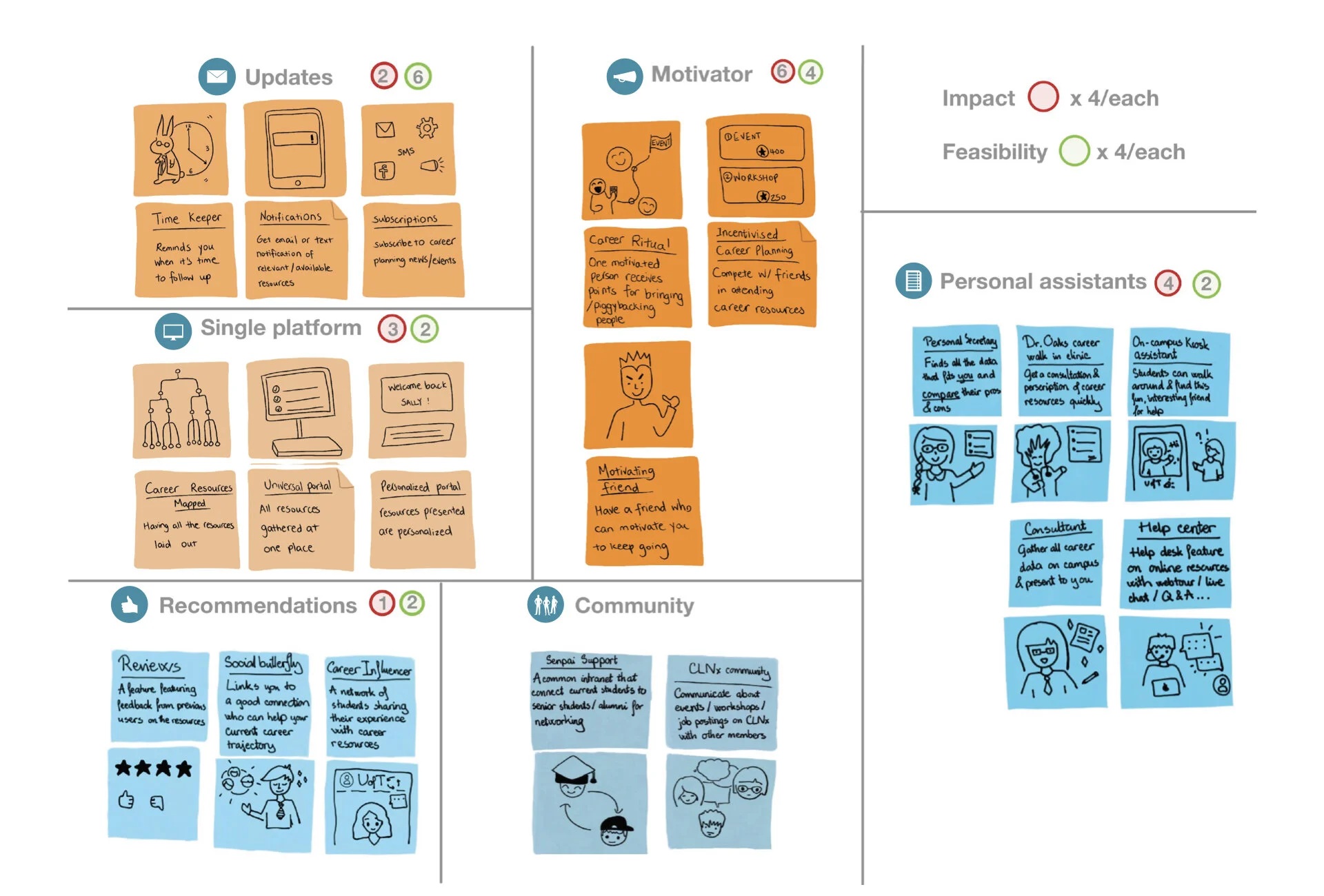
We voted in regards to each idea’s impact and feasibility, so to place onto the final prioritization grid as shown below. Each of us had 4 votes for impact / 4 votes for feasibility.
First round of voting gave us “motivator” as the major feature, but we RE-EVALUATED through discussion and decided it’s more of a later FEATURE than CONCEPT.
Second round of voting, we got rid of a few repetitive ideas, and this time voted individual idea instead of group. Result is shown below in the prioritization grid.
Prioritization Grid
Major ideas
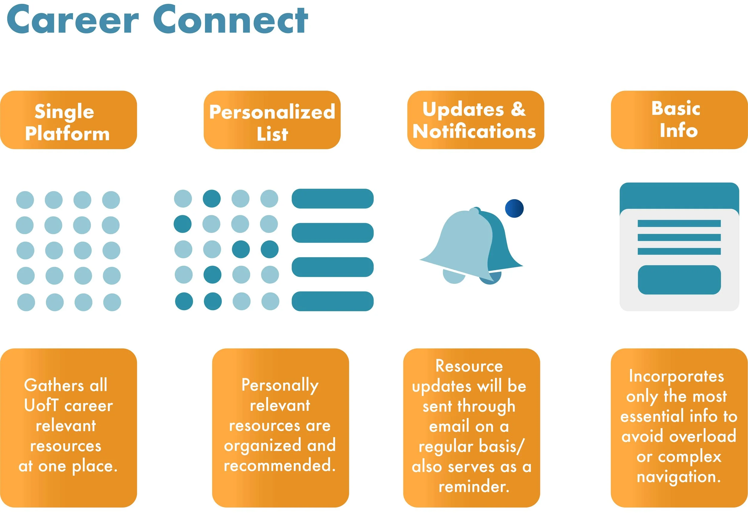
Career Connect seeks to build the bridge between UofT career resources and Sally
and the features chosen below should tackle each of them correspondingly:
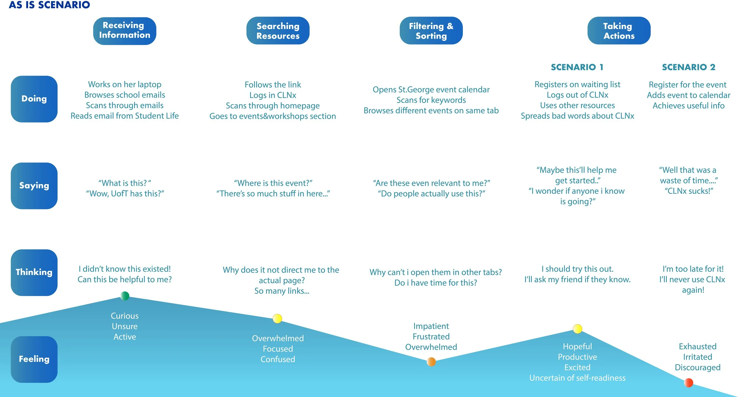
Change in Sally’s experiences
as-is vs. to-be demonstrates the before vs. after using Career Connect.

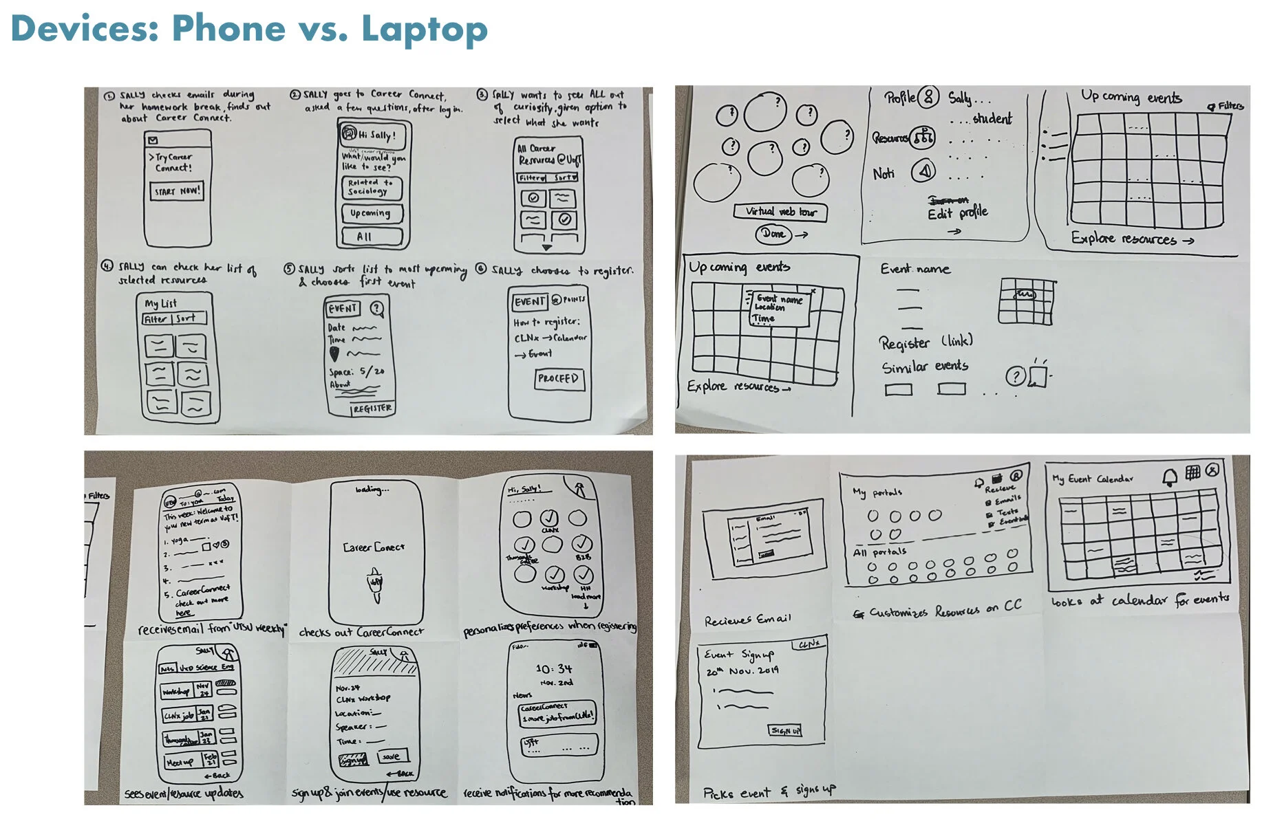
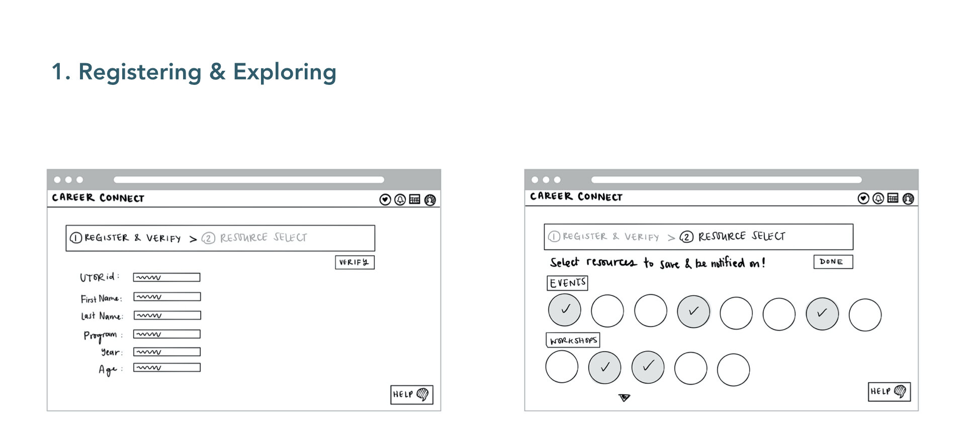
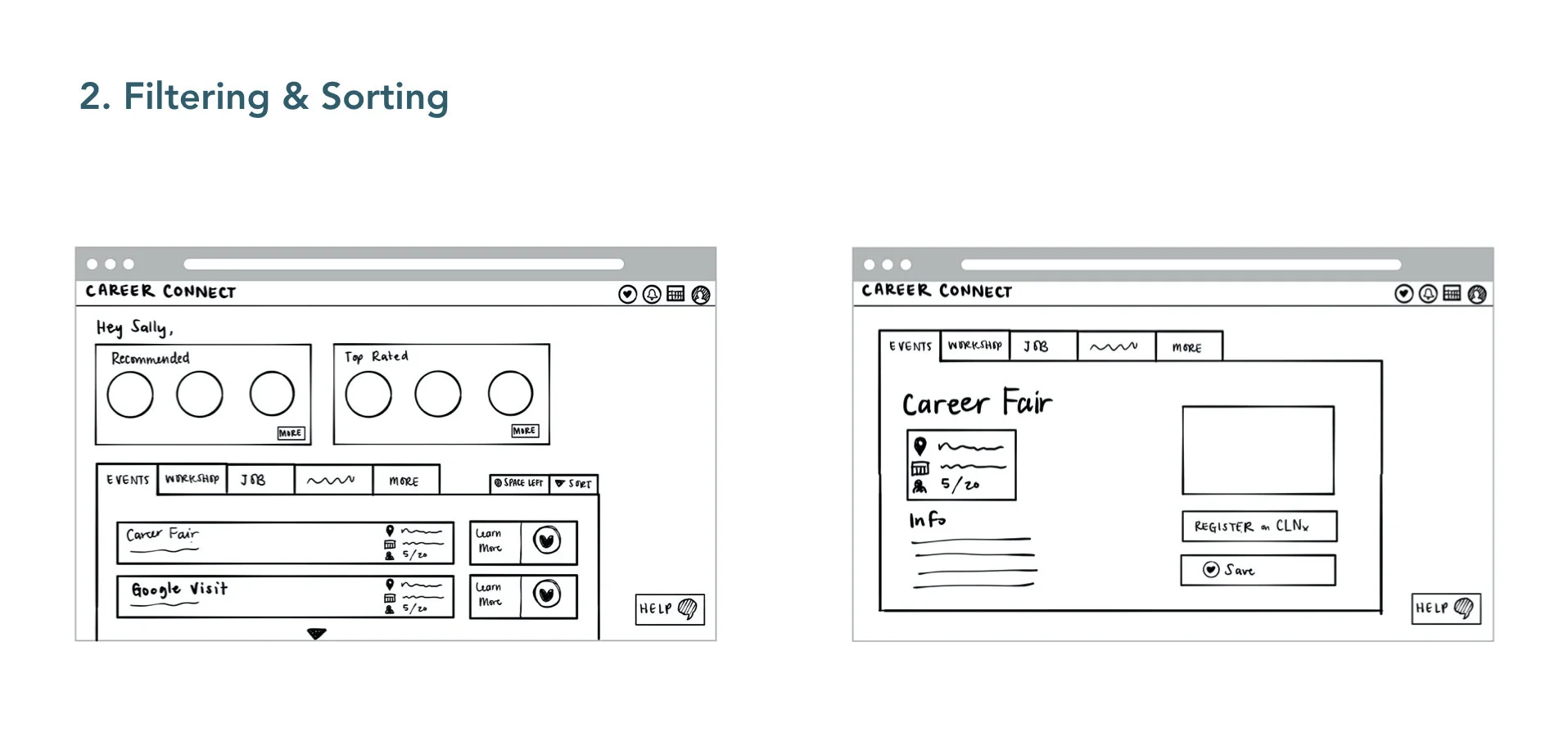
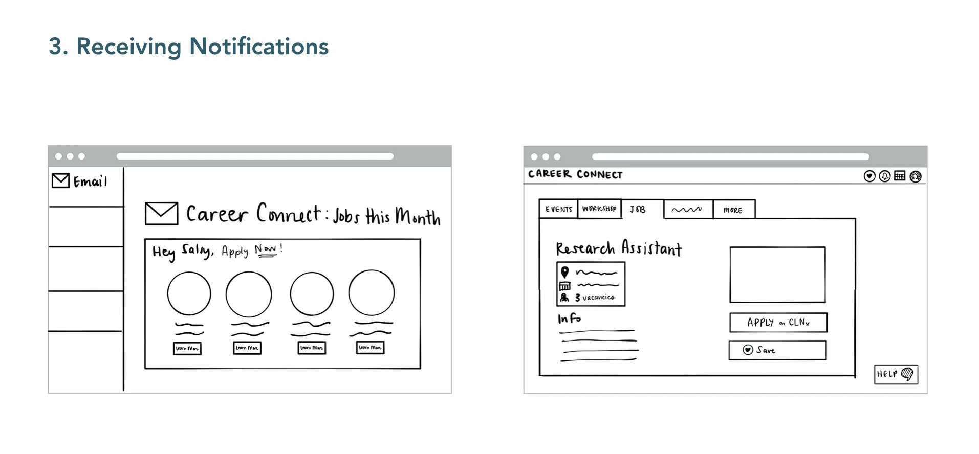
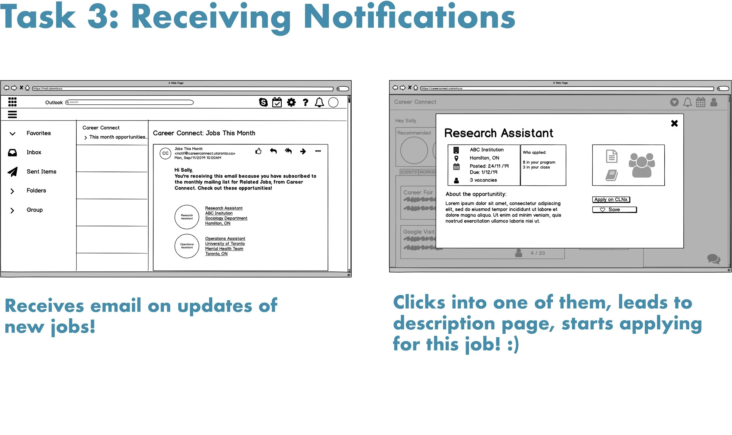
SKETCH: low-fi prototype
Previously our group members came up with both low-fi wireframes on phone & laptop.
But why laptop?
After referring back to the research data, we figured students prefer using LAPTOP when checking emails from school and filing career relevant resources.
Handdrawn sketch
IPad sketch
LEAN EVALUATION
Evaluation Conduction:
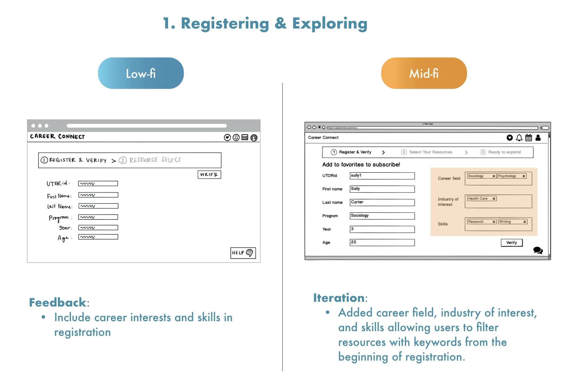
Evaluator walks through low-fidelity prototype in 3 sets of tasks, while communicating with and taking notes on feedback from the participant
Encouraging comments as Evaluator does walk-through and asks questions as participant goings through the flow
Representative participants:
Undergraduate Students (2)
P1: 1st Year Computer Science Student
P2: 3rd Year Rotman Commerce Student
Graduate Students (2)
P3: 1st Year Master of Information Students
P4: 1st Year Master of Information Students
Iterations
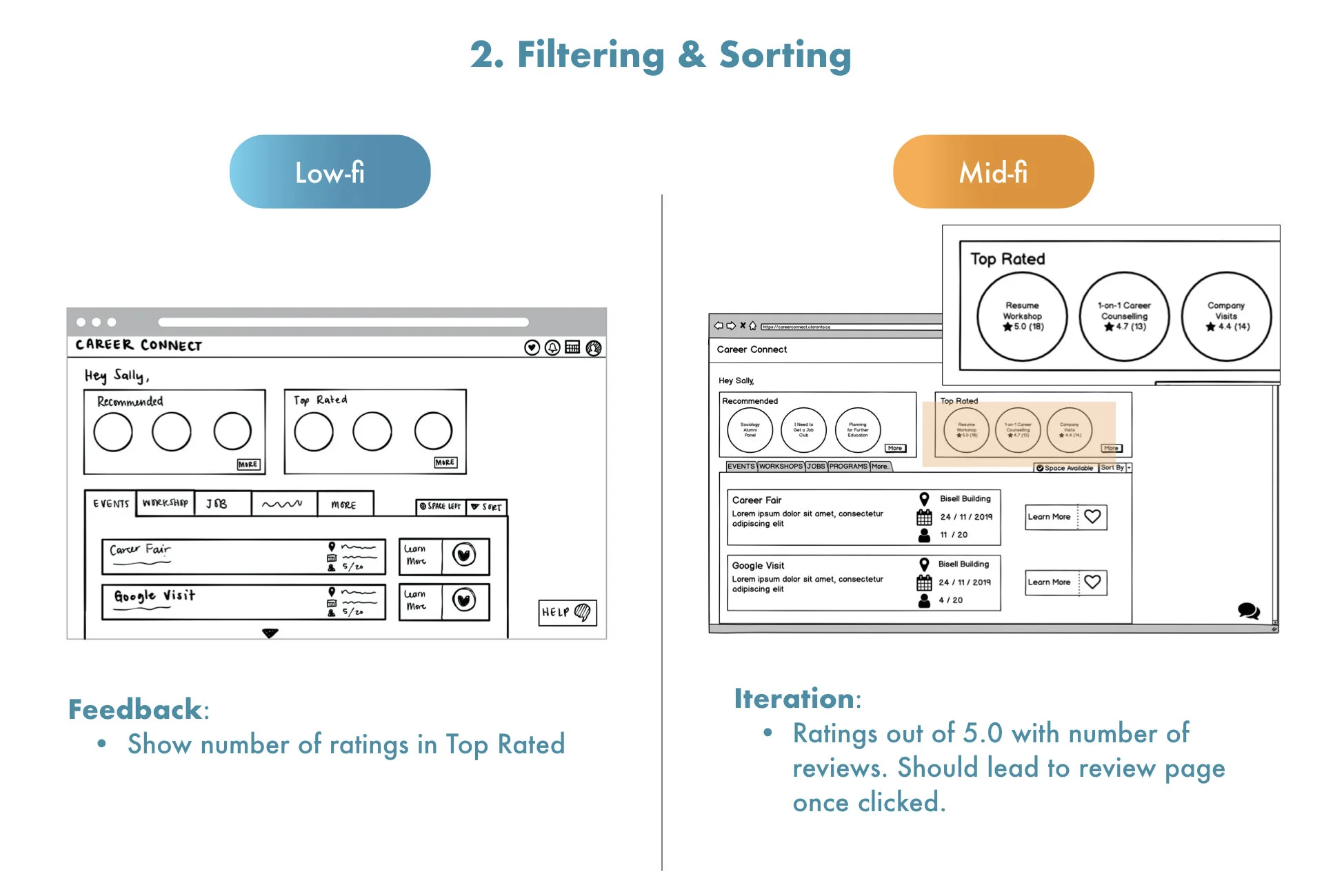
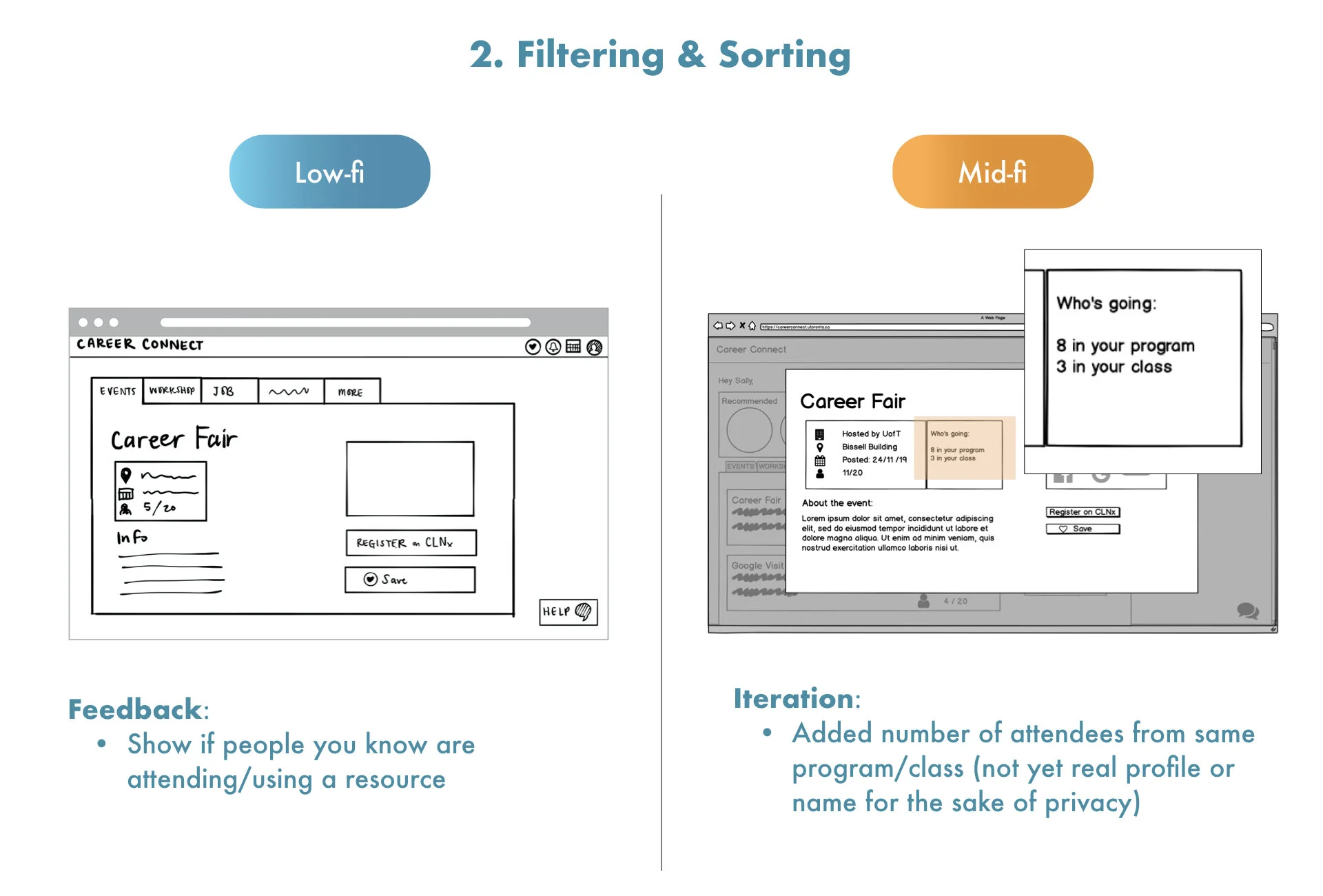
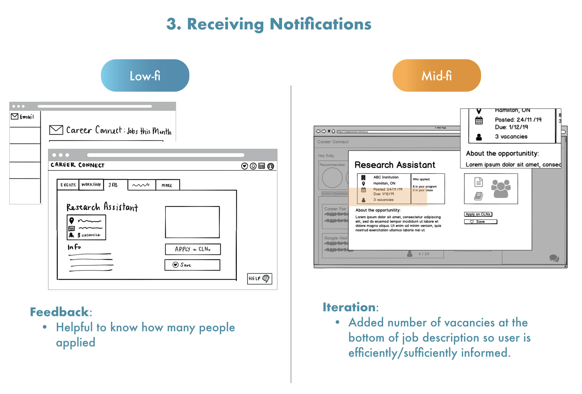
MOCKUP: mid-fi prototype

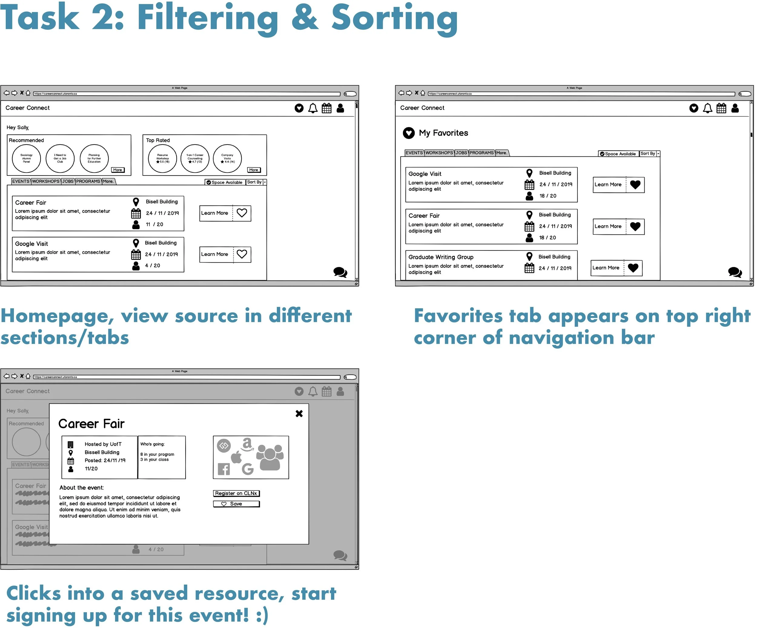
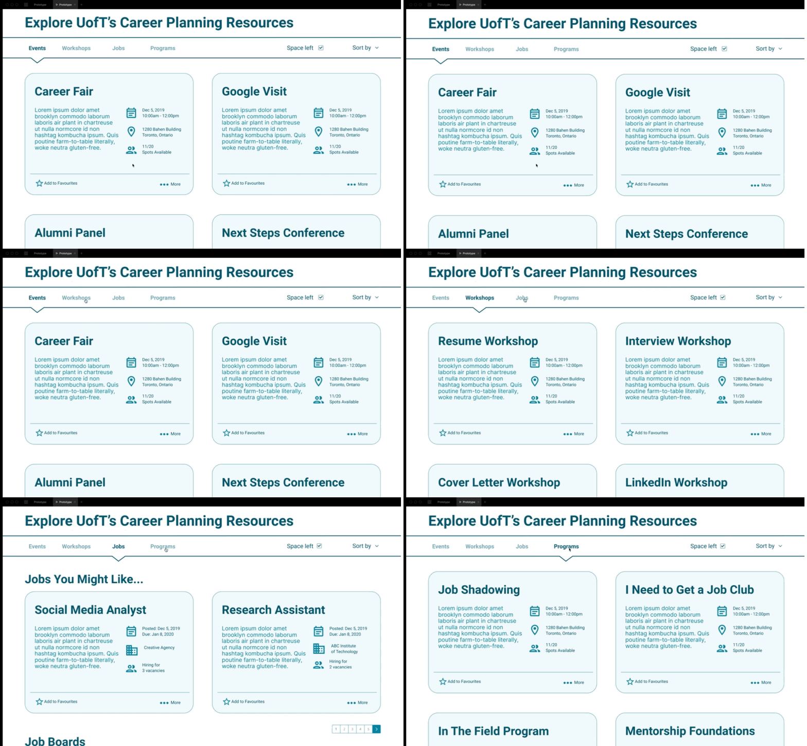
PROTOTYPE
Value: Awareness & Convenience
Feature: all resources in one single platform, organized according to different type of resources.
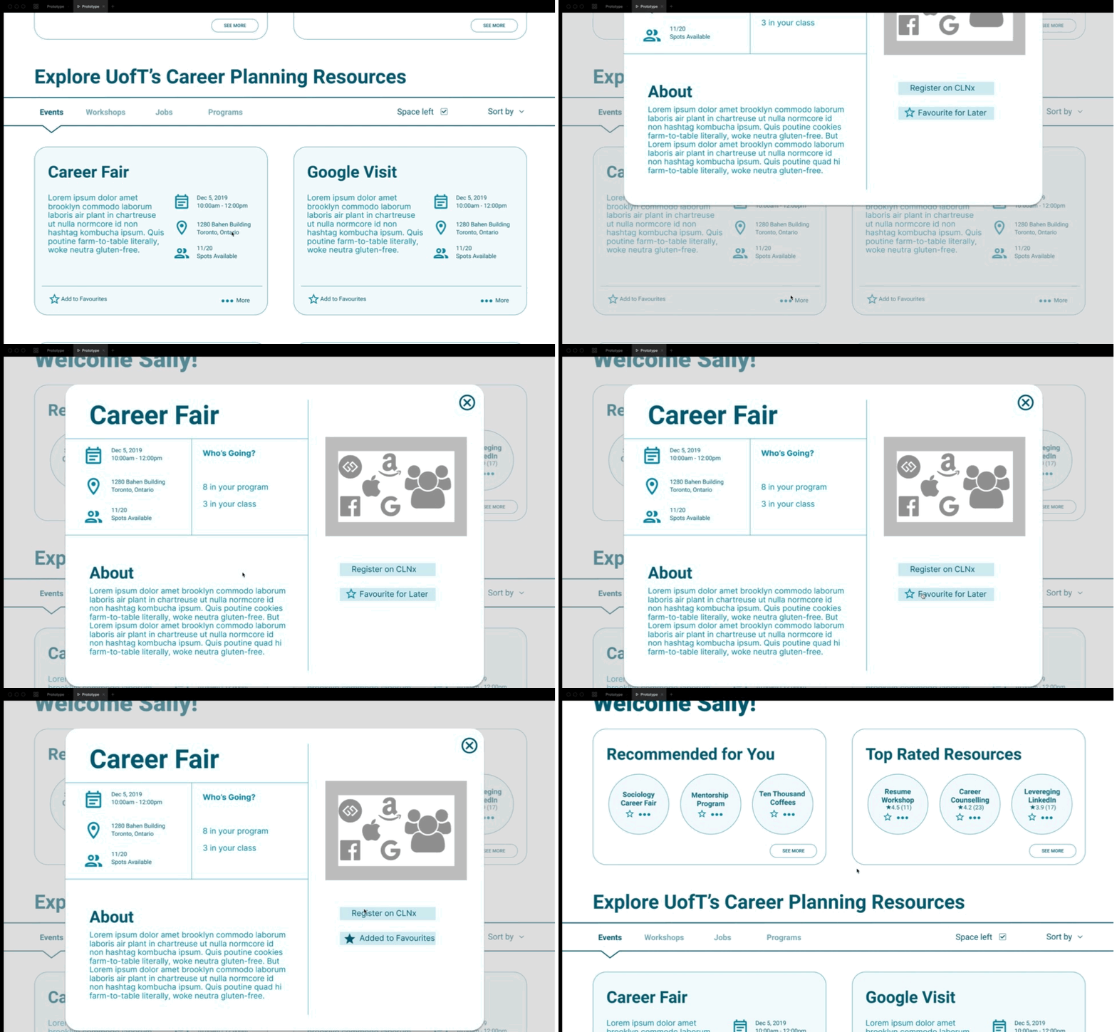
Value: Efficiently informed
Feature: core basic info presented on one page, can customize by adding to favourite list/register on CLNx.
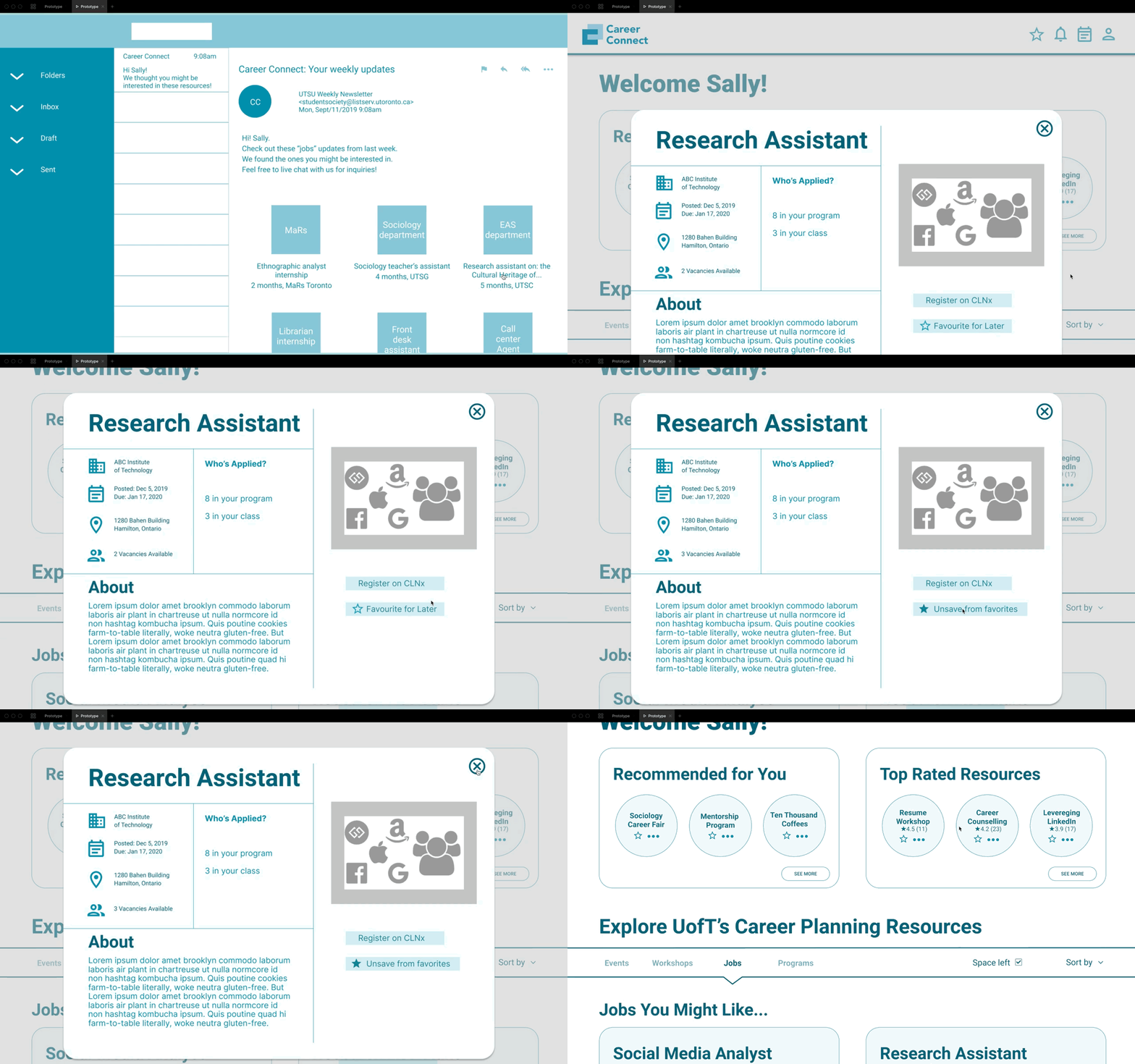
Value: Stay aware in busy life
Feature: recommendations/updates & notifications through email, serving as a reminder to keep students on track and motivated.
Minor features
Value: Assistance/convenience
Feature: live chat

Value: Motivation
Feature: Rewarding system (badges)

USABILITY TESTING
Evaluation Methods
We conducted 2 types of evaluation methods:
User Testing to see if our prototype functions expectedly
Semi-structured interview for after the user-test, to get a reflection from a participant on Career Connect
Practical Issues
Design Tasks are outlined by our three main tasks, with a set of questions and things to look out for.
Participants include P1 (3rd Year, Undergrad), P2 (4th Year, Undergrad), P3 (1st Year, Undergrad), and P4 (1st Year Grad). These are all representative users because they have access to UofT career resources.
Testing conditions involved sitting at a desk, sending the participant a link to our prototype (view-only) or allow them to use the prototype on our laptops, while we took notes on their actions, feedback and response.
FUTURE STEPS
Fixes to Current Web App
Clarify the Top Rated feature, and differentiate with Recommended
Further develop the Recommended list to give more specific results
Add the notification settings to the notification page instead of profile
Remove age info on the registration form
Features for Next Iteration
Google map can add onto description page in "location" area
Adapt a new mobile version
Calendar - integrate with school schedule, and allow exporting calendar events to personal calendars (Google Calendar, Apple Calendar, etc).
Develop social network features among users by enabling options to connect.
Research
Look into how tasks on Career Connect can be optimized for mobile - understand what tasks would be successful and what would be strenuous.
Look into students’ willingness to download new applications or sign up for new services offered by UofT. Also would be good to look into that journey of receiving information - people receive emails but how much do they read?
TAKEAWAYS
1. Do one thing, but do it very well
Before user research, we had a lot of ideas in mind, like a career resource peer piggybacking, prof-student chat group, etc. but it seems hard to feature all in one place. After user research and analysis we settled with key values of the app and it gets clearer of what we want to build. Rather than devouring all we want to do, do only the things that matter the most and do it very well is the more logical way of design. Overall, quality > quantity when it comes to the final product features.
2. Connect the dots and always refer back to the “user”
It’s easy to forget the “user” (or persona) as the project progresses along. But it’s crucial to take “user” into account in every decision we make, and it does makes a huge difference. Such as phone vs. laptop wouldn’t have come to a decision without looking at our user research data. Although we envision to build a mobile app counterpart for it, the laptop version serves better at the first place because students’ career activities take place primarily on their laptops and we would miss a big part of it without connecting the dots along our design process.