
Community Project: Ve'ahavta Web-app Redesign
BACKGROUND
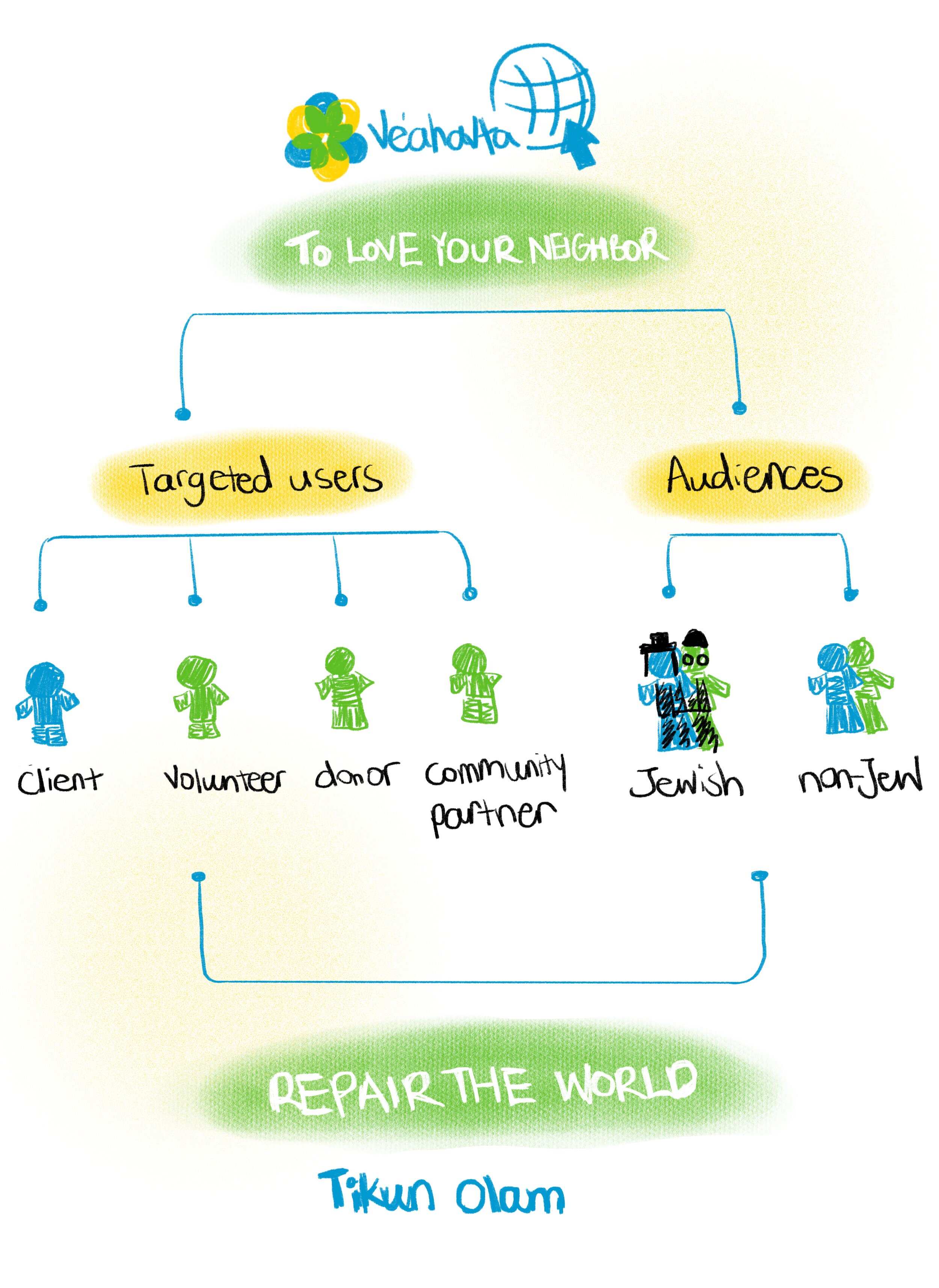
Ve’ahavta is a Jewish humanitarian organization who aims to help the marginalized population in poverty or homeless conditions through providing multiple ongoing services, programs, and workshops to support its clients. In this project, we helped Ve’ahavta re-design its information architecture and user experience, so to better promote the organization’s values and good cause to the public at large.
DESIGN PROCESS
Click to interact: LIVE DEMO
CHALLENGE
How does Ve’ahavta increase engagement from more of its targeted audiences?
SOLUTION
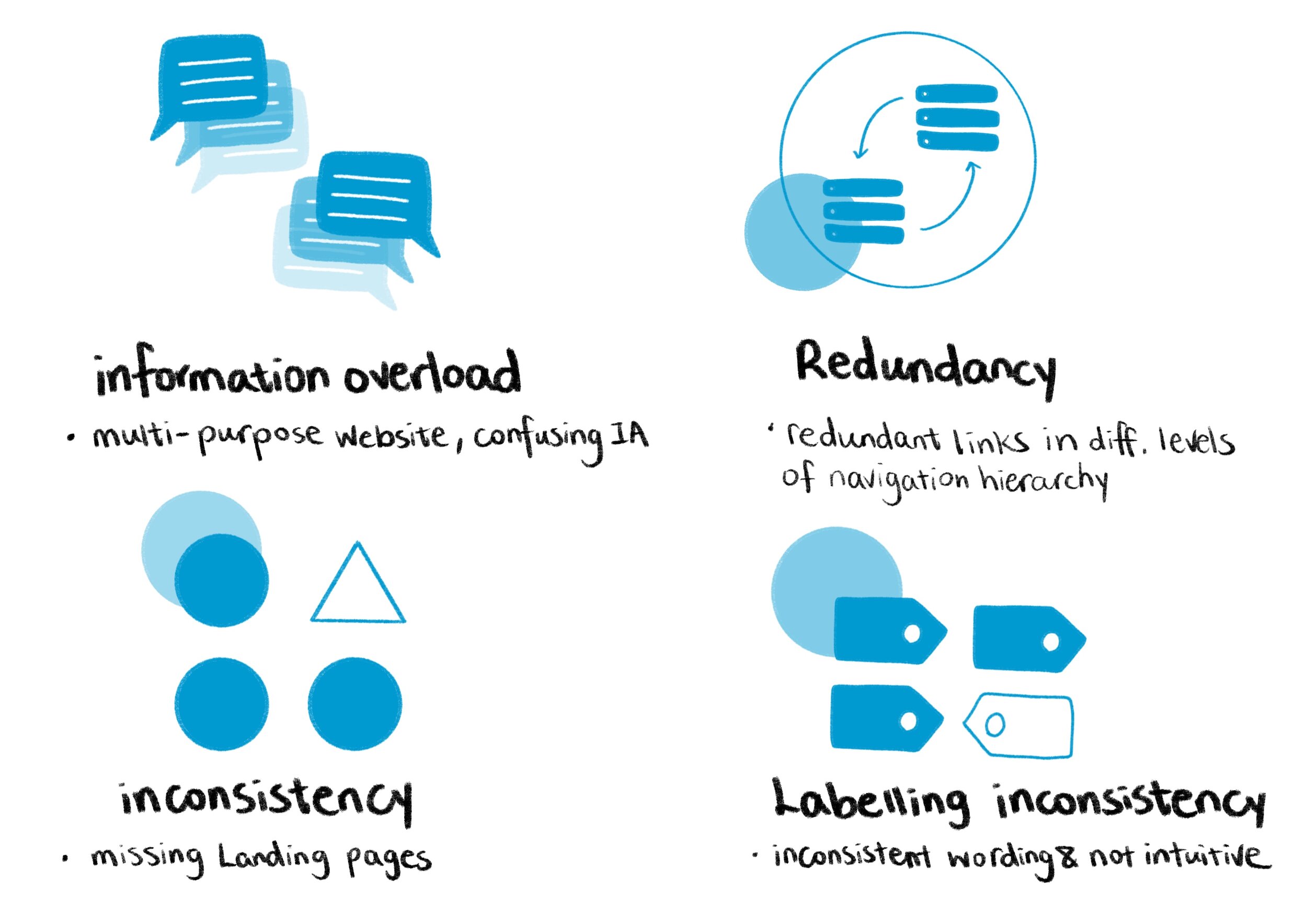
IA + UX redesign to solve inconsistency and information overload
PARAMETERS
Tasks:
UX redesign, IA redesign
Communication, Report Writing
My role:
Context/content analysis, user research, card-sorting test design, UX analysis, Information Architecture schematic diagram redesign, storyboarding, UX redesign & prototyping, report writing
Client:
Ve'ahavta, a Jewish humanitarian organization dedicated to help the homeless and the marginalized in the community.
Time & Location:
September - December 2019
INF2170 Information Architecture (IA), iSchool, University of Toronto
Skills:
Figma, Adobe Illustrator
CONTEXT & CONTENT ANALYSIS
Research
01 Semi-structured interview
Interviewees: Ve’ahavta’s Director of Communication, Manager of the organization, and Graphic Designer.
Method: Conduction of 20min/person interview with three core members of the organization.
02 Usability testing
Users: 2 proxy users from Master of Information at UofT, given the limit of access to real users at that time.
Metrics: on task success(binary success), time-on-task, errors and efficiency.
Interview Findings
Usability Test Findings
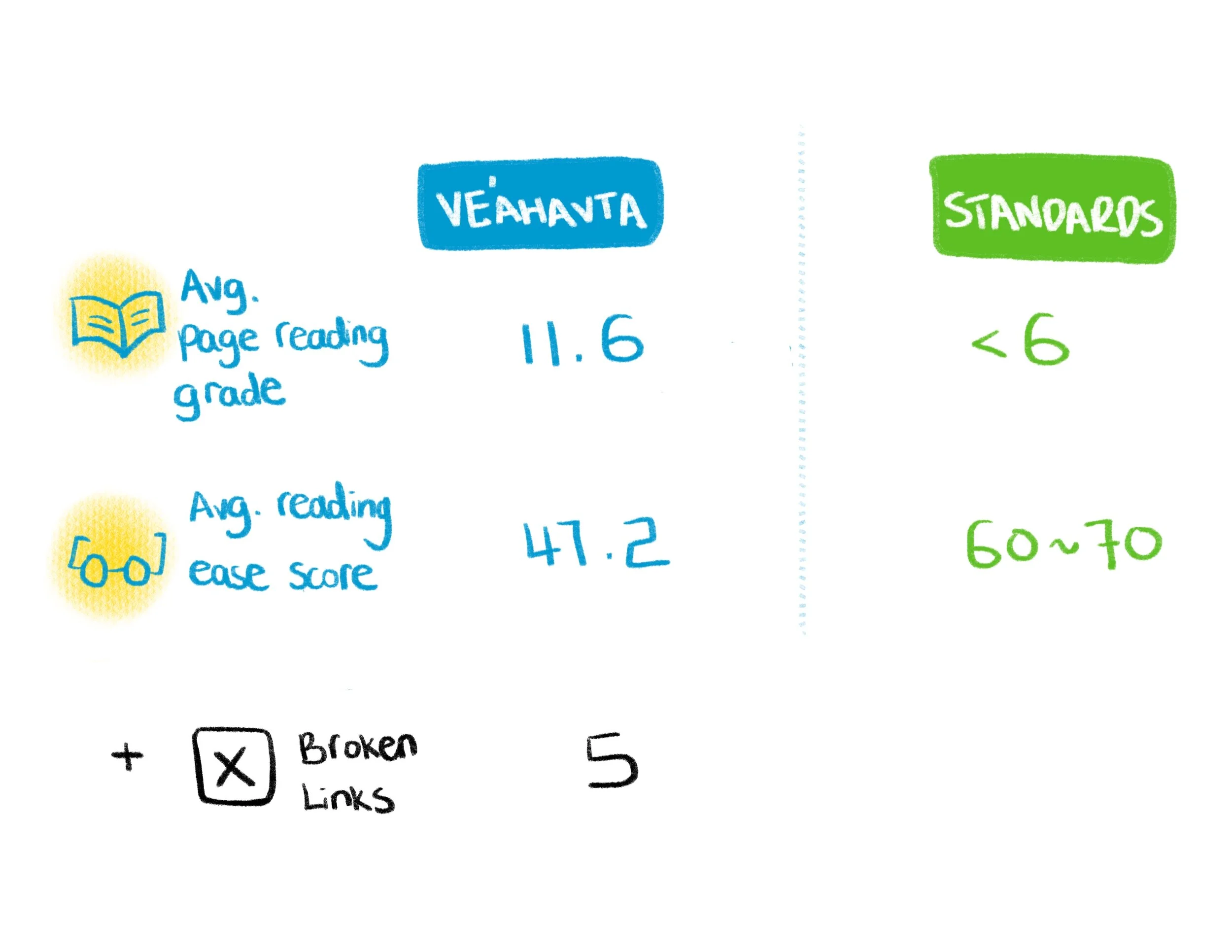
Content Auditor Findings
A high reading grade and low reading ease score indicate that Ve’ahavta’s website contents are more difficult to read or follow than a standard one and may cause stress in whoever is visiting the site and looking for a program to join. click here to see full report.
CARD-SORTING
click to enlarge image.
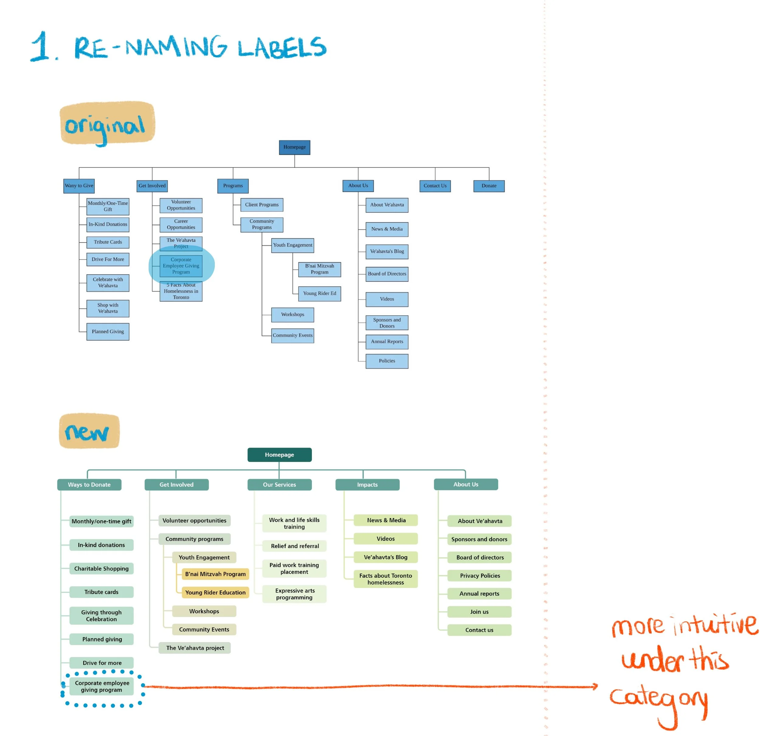
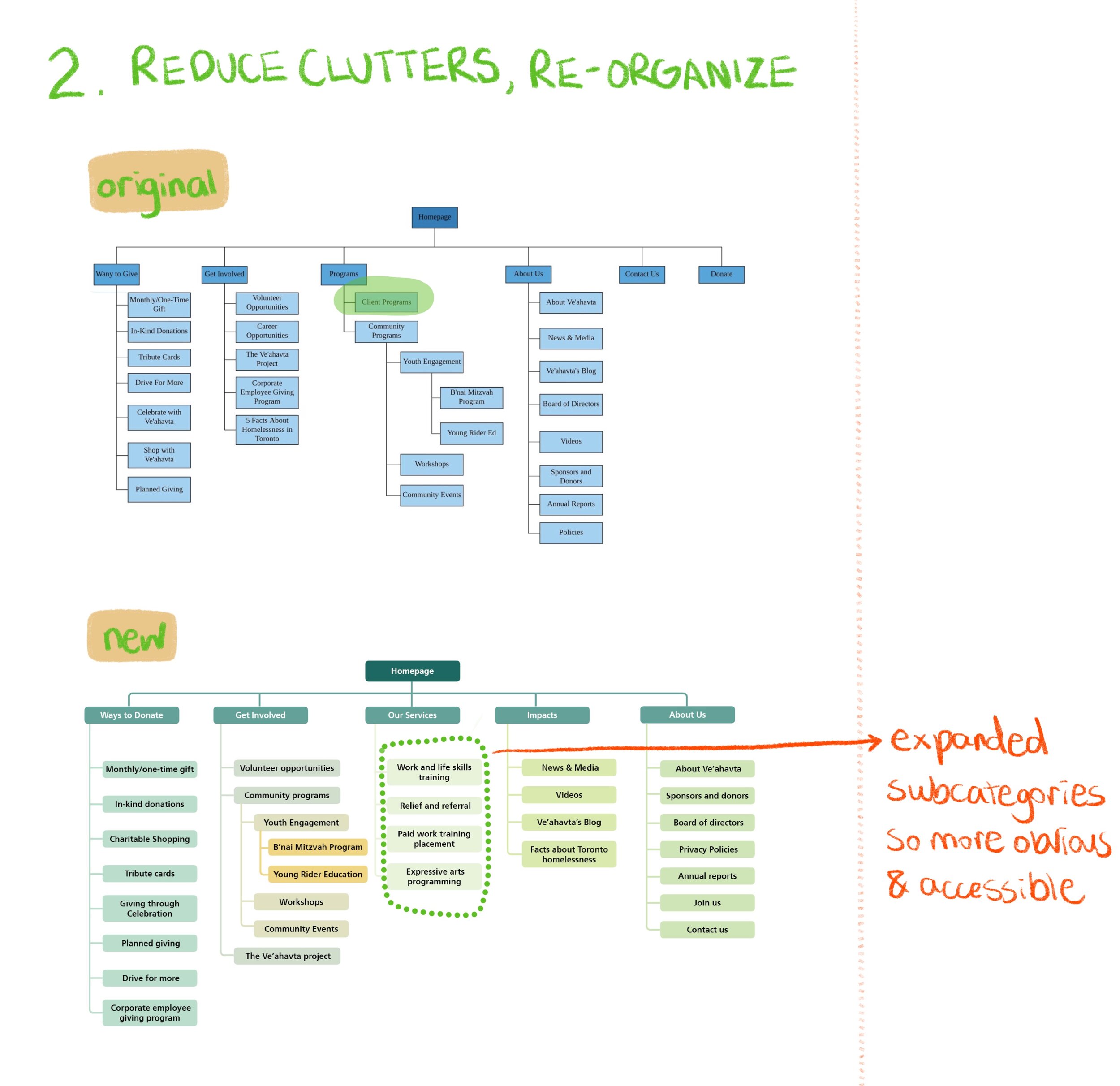
Prior to the card-sorting we redesigned the IA based on interview/usability testing findings. Then we conducted card-sorting to see if new IA functions user-friendly and intuitive to the users themselves. For complete activity click here.
1 renaming labels
2 reduce clutters
3 new category
Results
Final IA changes
USER SCENARIOS
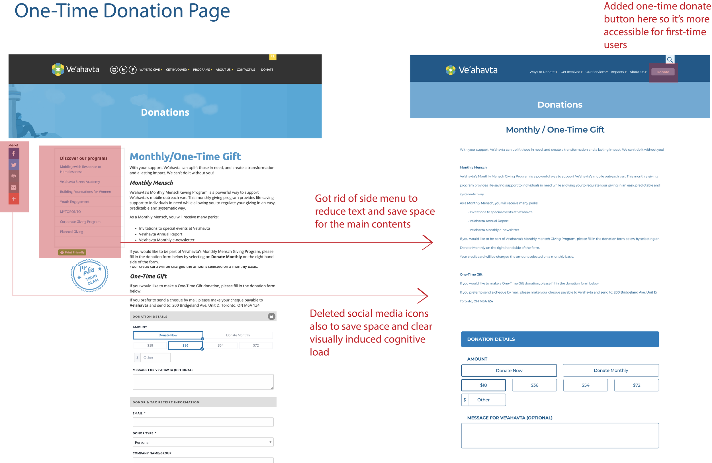
01 Donor making one-time donation
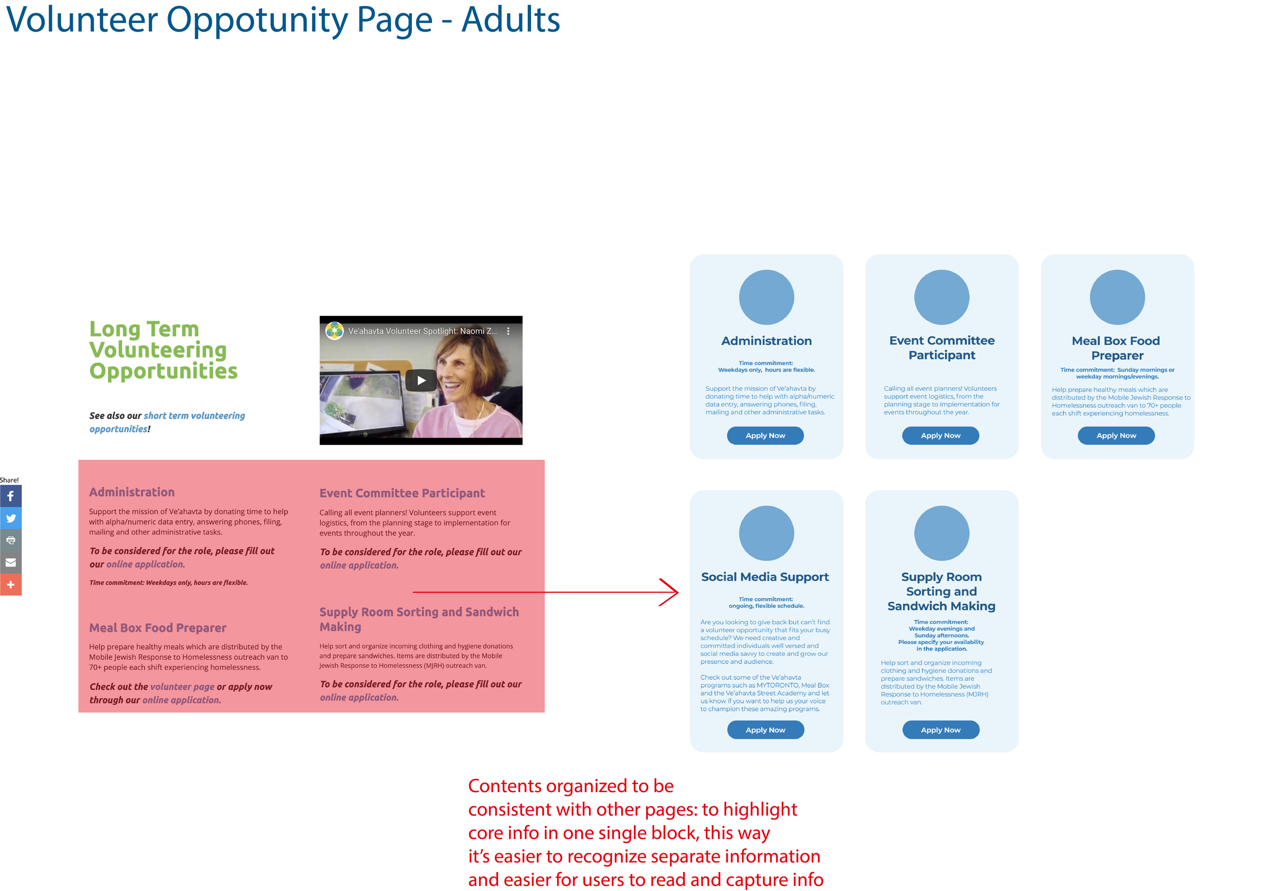
02 Volunteer signing up for long-term program
03 Client joins expressive arts program through photo contest
04 Community program purchaser looking up for events
UX changes
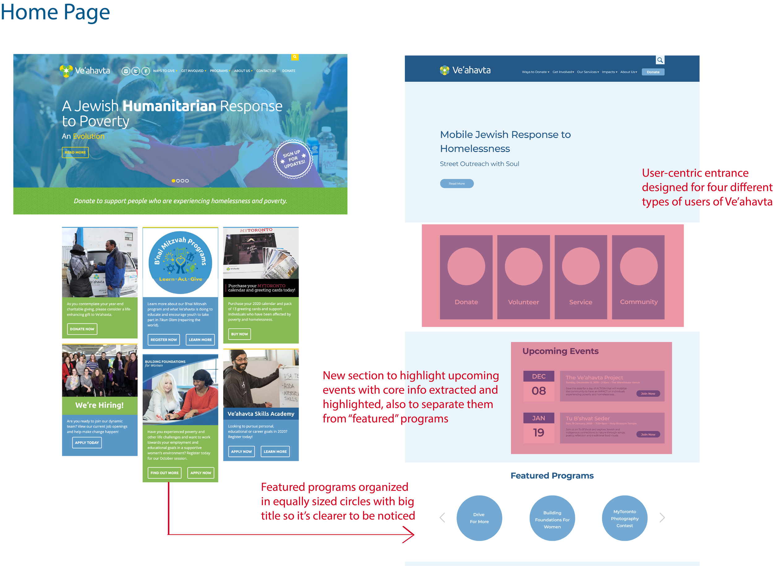
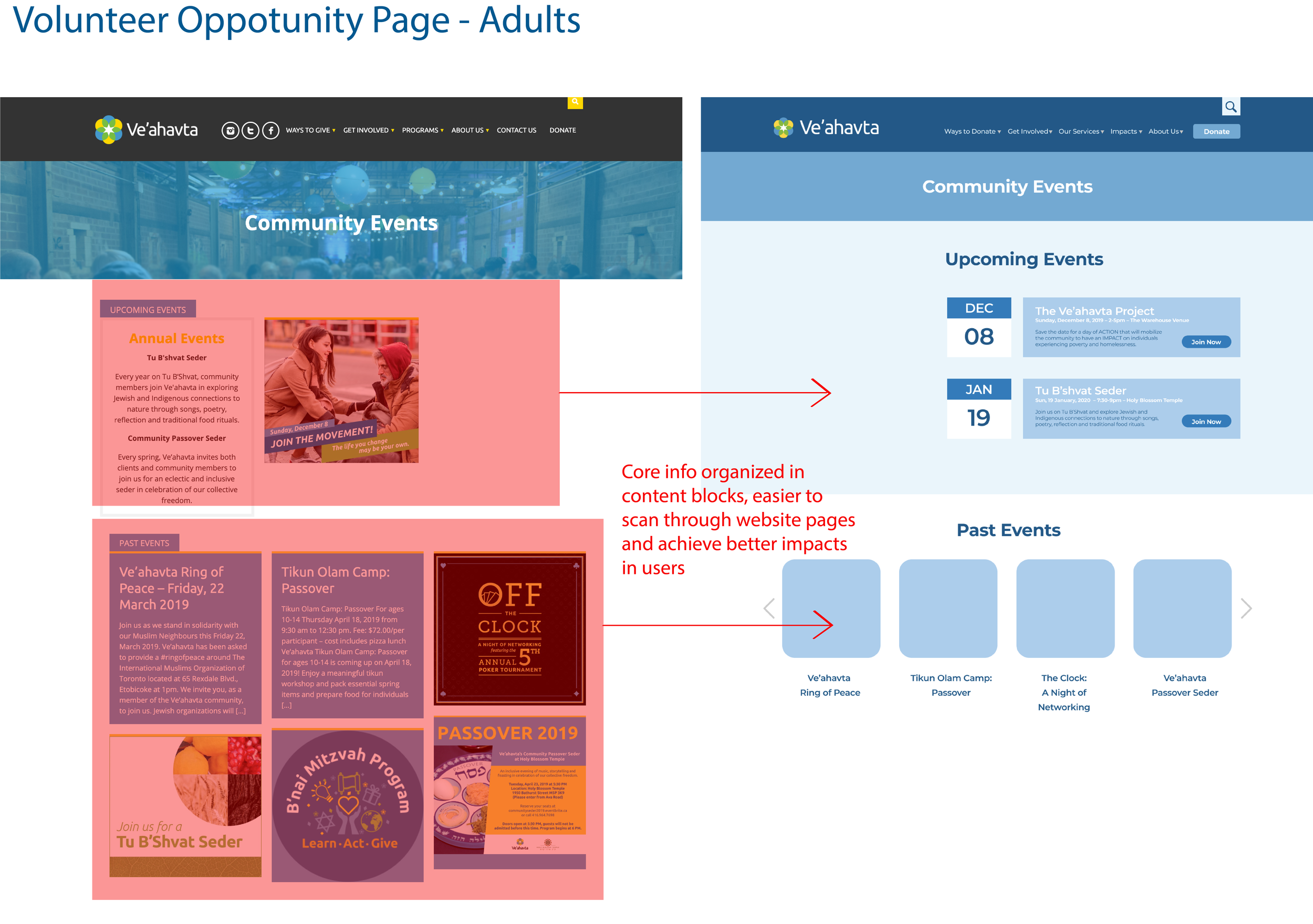
There are several UX changes we made to the website while wireframing, it came secondary because IA was our major task at the first place. To enhance the UXD, we added landing pages for each main category on the navigation bar, rearranged and reduced the content blocks for some pages so to improve the visual representation of the website and better promote its causes.
PROTOTYPE
TAKEAWAYS
In progress….