Product design at CBC News
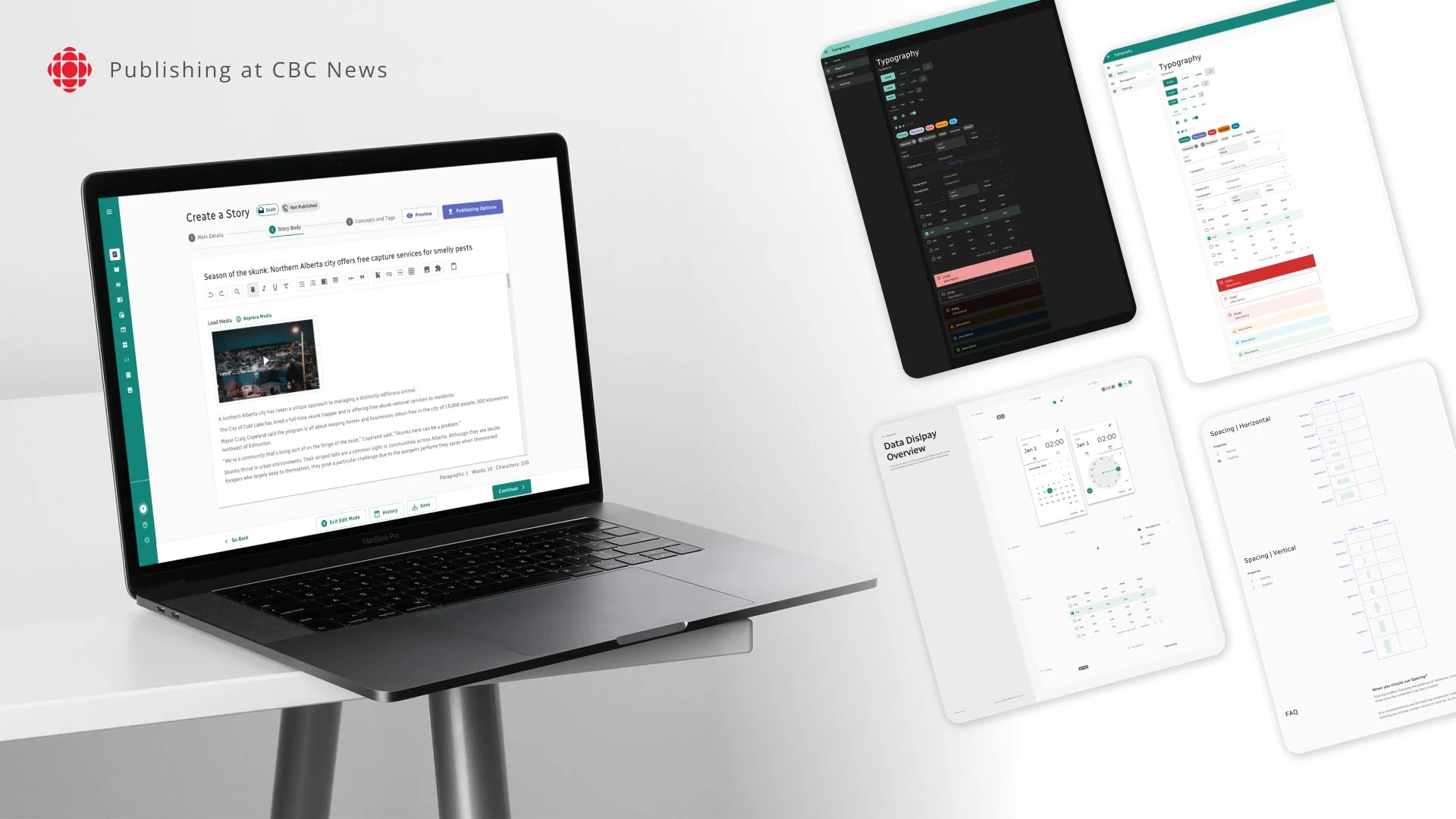
Overview
Since 2022, I’ve been working at CBC News within the Publishing portfolio which targets the content producers who create and publish articles on CBC.ca. As of now, this portfolio focuses on replacing CBC’s internal publishing tools. As per the portfolio name, “Publishing” covers the entire user experience from content creation to performance analysis.
Our two main products are MiR, a data-driven analytics platform that provides insights on content performance, and Nine, an in-house content management system (CMS) enabling seamless content writing and publishing on CBC platforms.
Timeline: Since August 2022
Title: Product designer
Tasks: Product design, high level product strategy, design system, prototyping, UX research
Product: 1)MiR-analytical platform 2)Nine-CMS
Context
CBC priorities
As a national news agency, CBC places a high priority on both news production quality and data confidentiality. After years of relying on third-party platforms, developing a proprietary set of in-house tools became a top request. It was the right time to make this crucial shift.
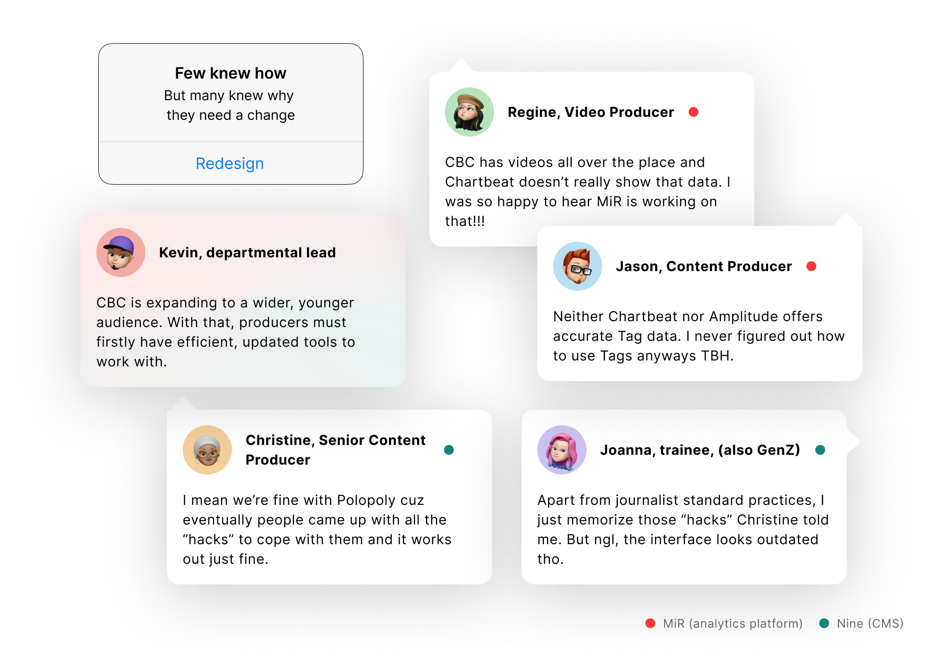
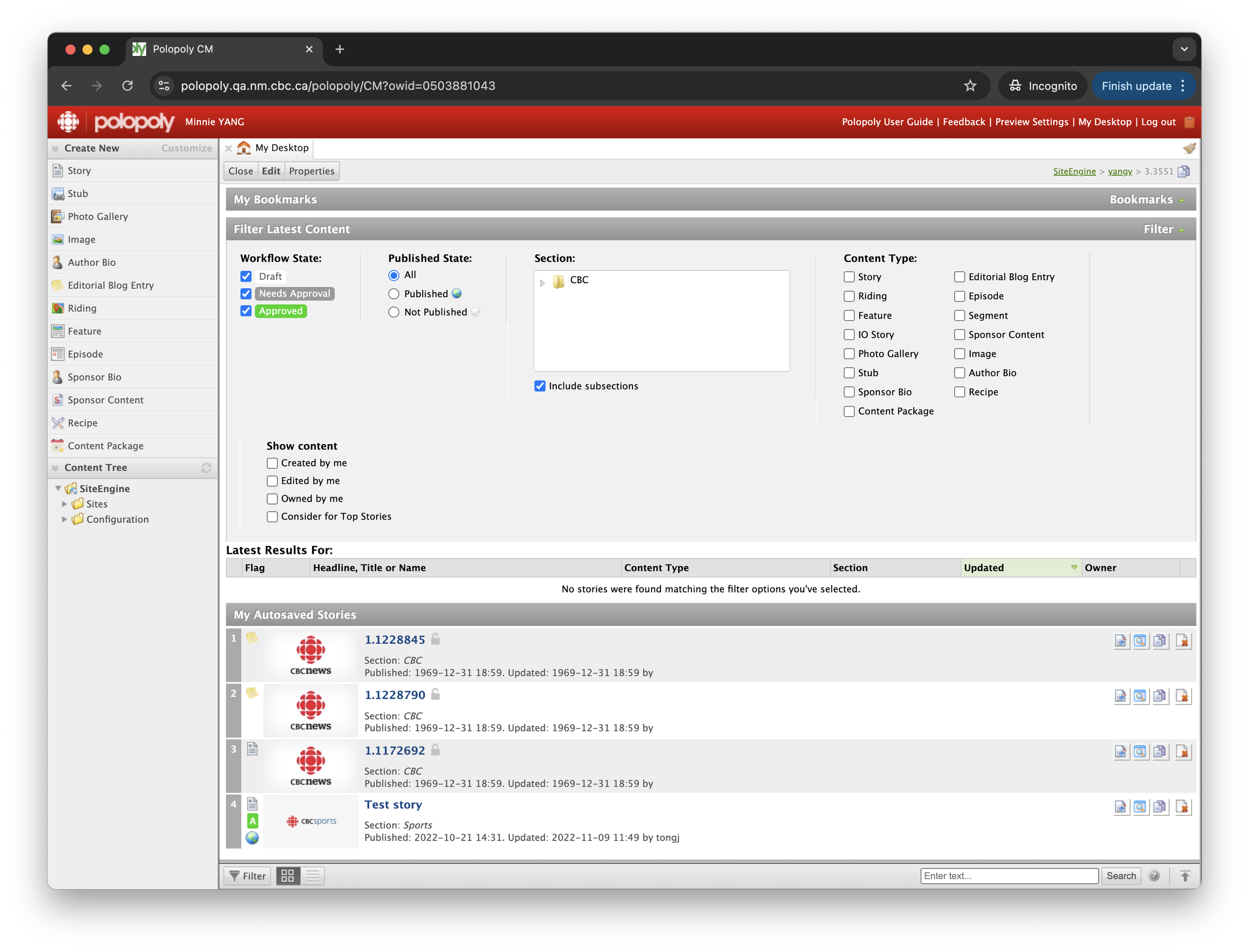
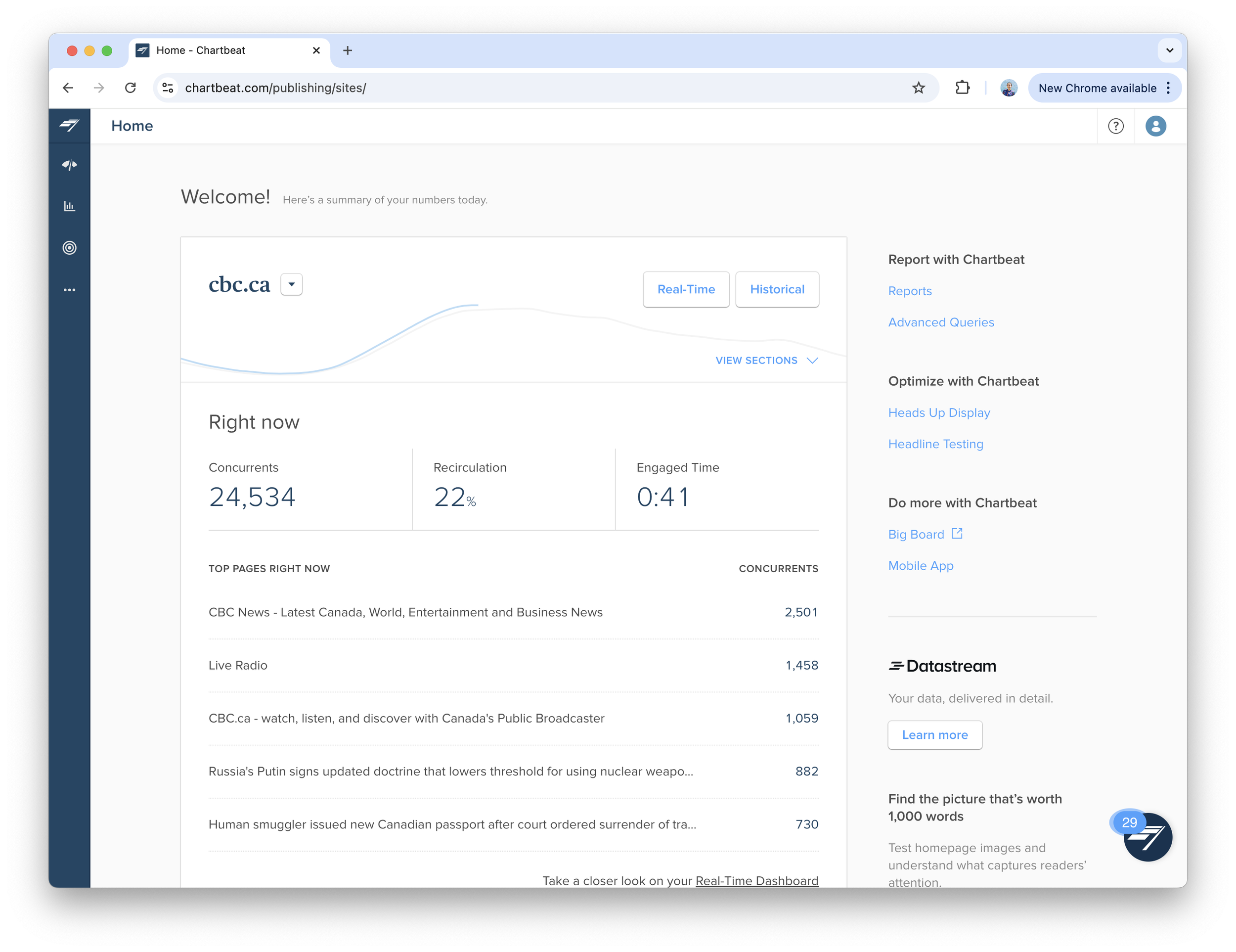
Third-party platforms to be replaced
Polopoly: content management system
Chartbeat: analytical platform
Team structure
MiR and Nine have separate product teams and PMs but share the same user group and goal of replacing legacy tools. I co-led the design of both products together with another designer.
Problem
As a new portfolio with complex configurations, Publishing needed UX to function as a bridge for the two products. This encountered some challenges.
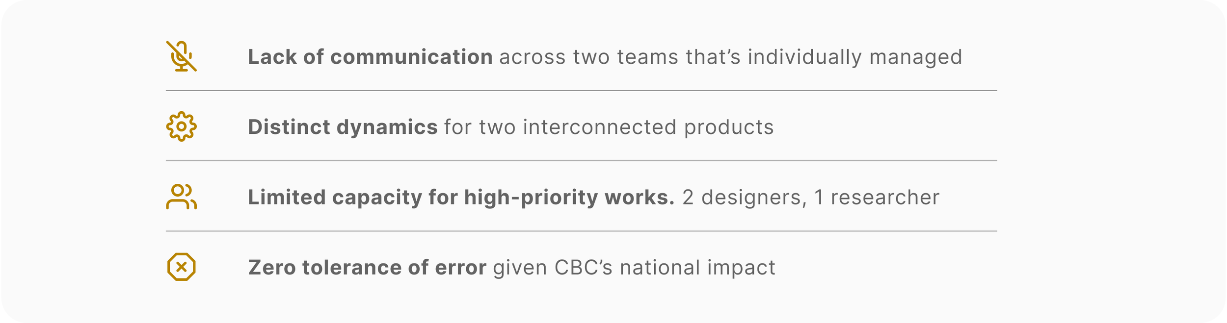

We decided to use First Principles Thinking to guide us through problem solving.
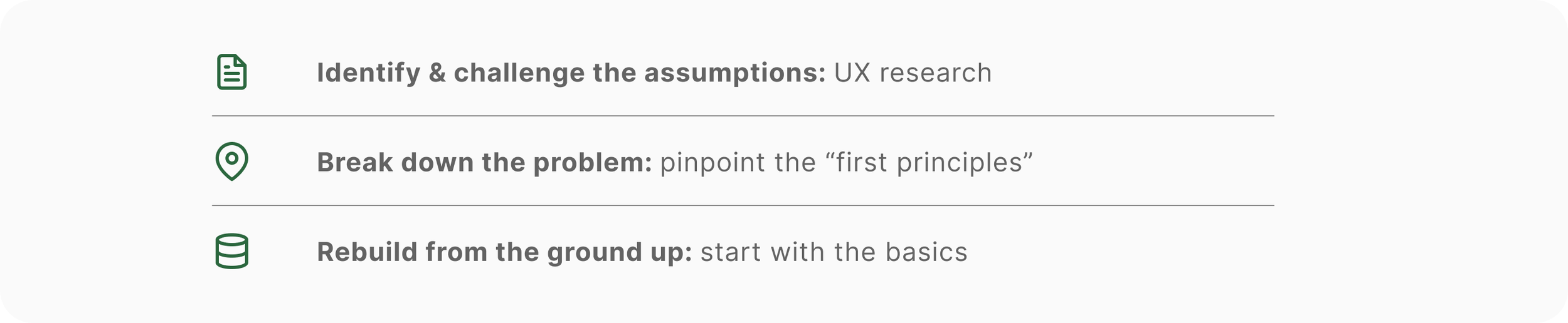
Timeline
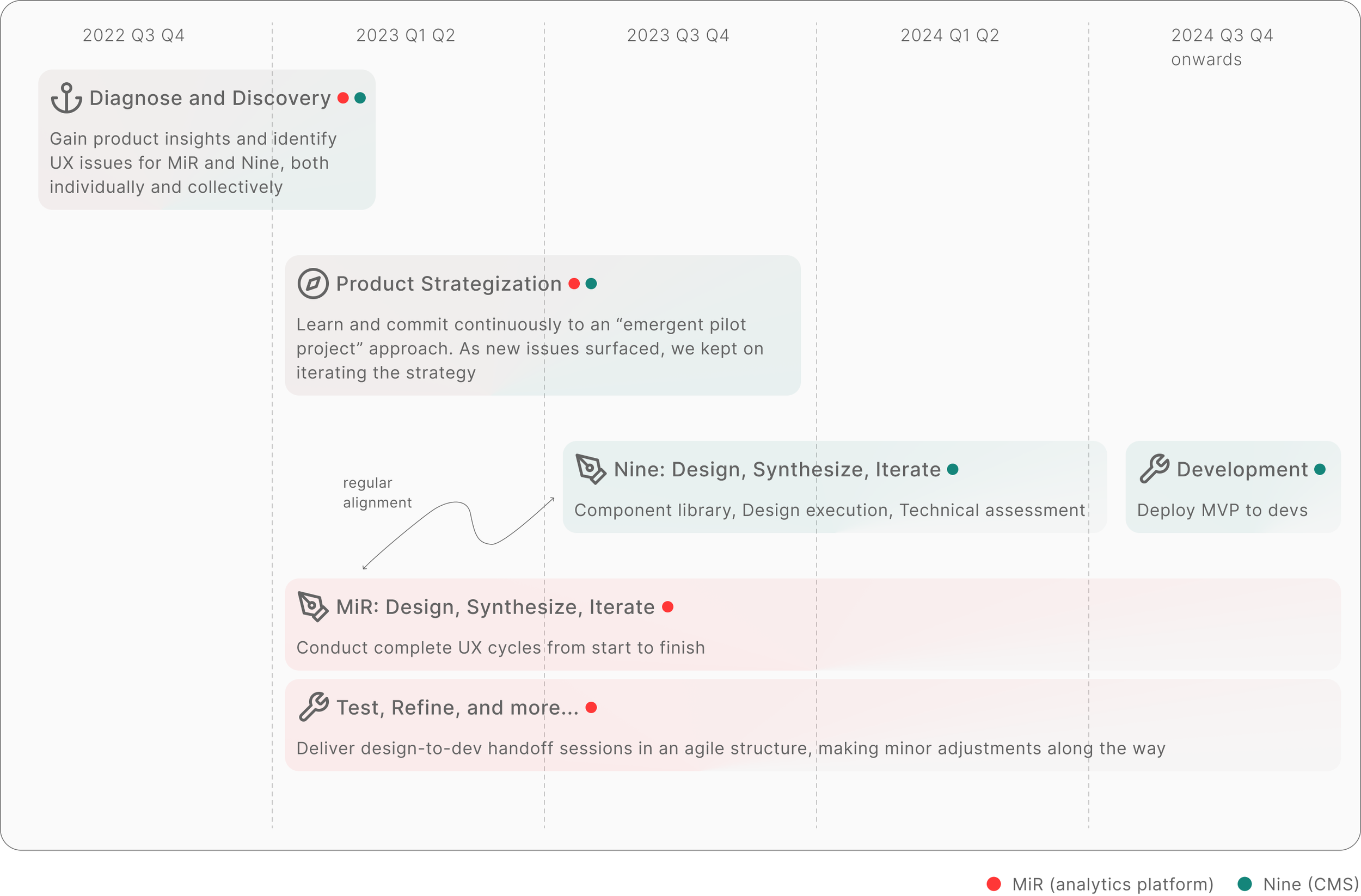
Strategy in Action
With the First Principles Thinking in mind, I set off my journey to look for the Principles.
1 · Discovery
I began with structured research to pinpoint UX issues, then led affinity mapping, and prioritization workshops with the product teams to turn insights into tasks.

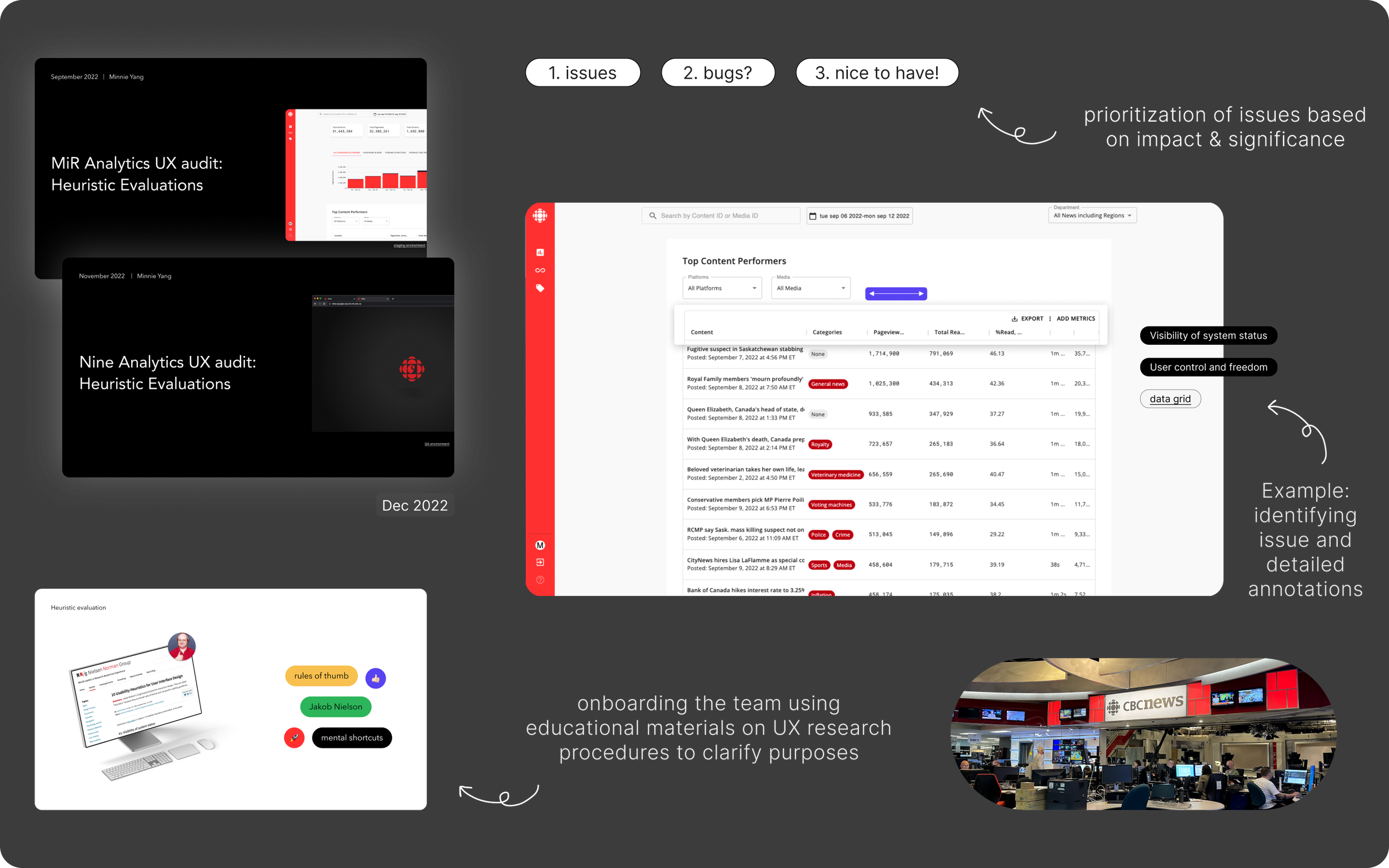
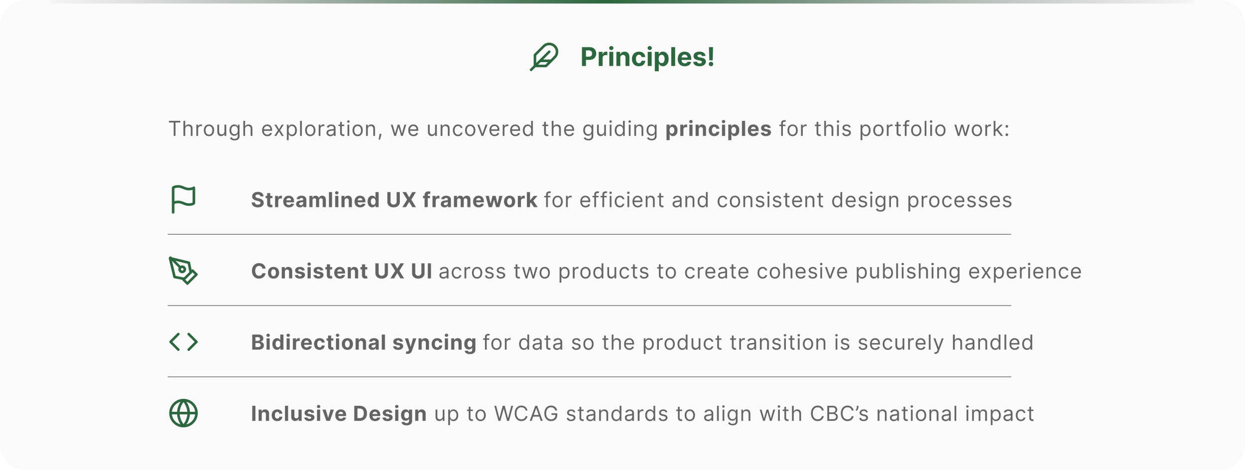
Throughout this process, I came across common themes. After careful synthesis, the team together located our principles.
2 · Strategically designing
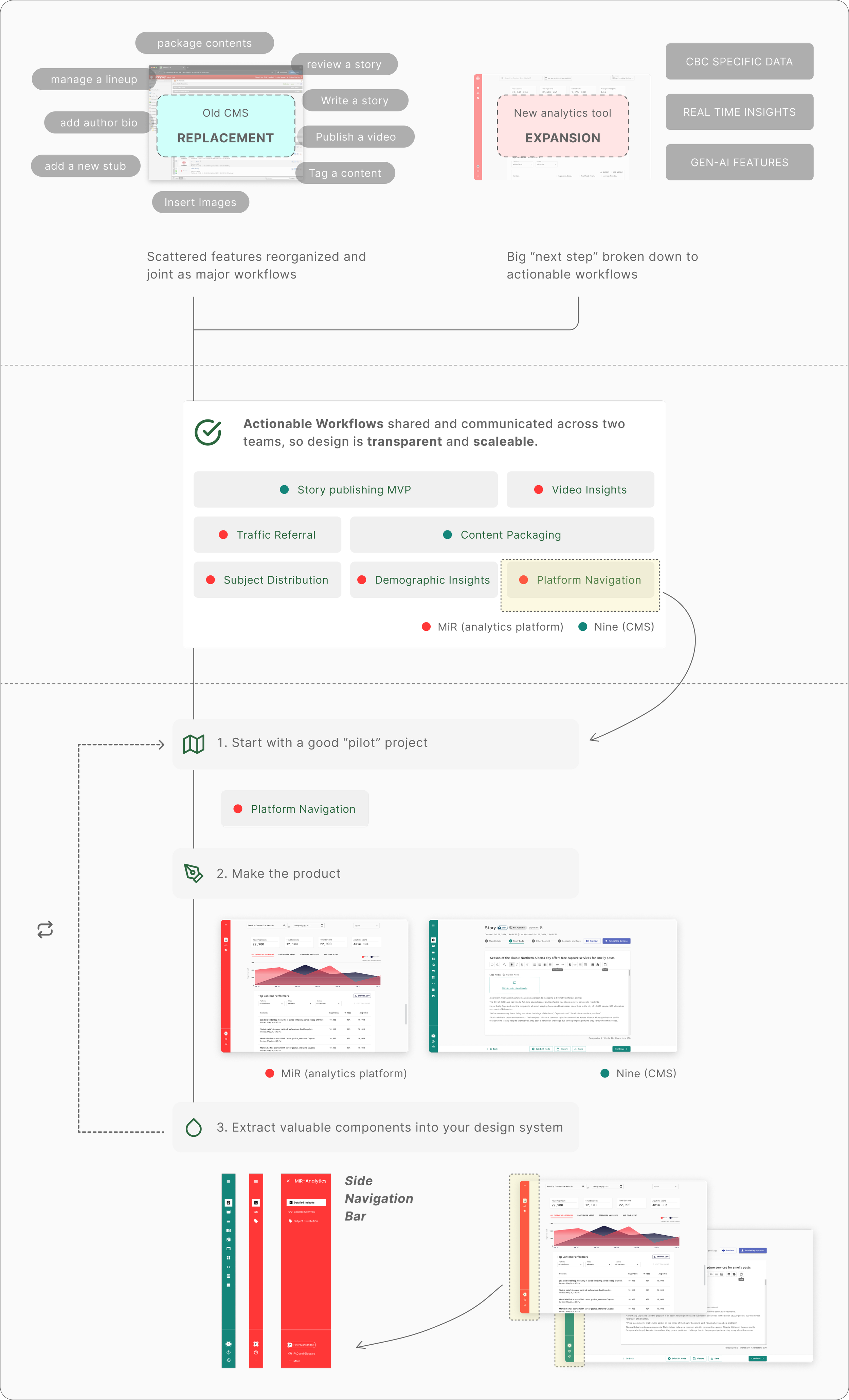
While learning methods to achieve our principles, I took Dan Mall’s course and discovered the “emergent pilot project” approach. We turned features and objectives into workflows, built a sustainable UX framework, and started developing a design system.
3 · Accessible from the start
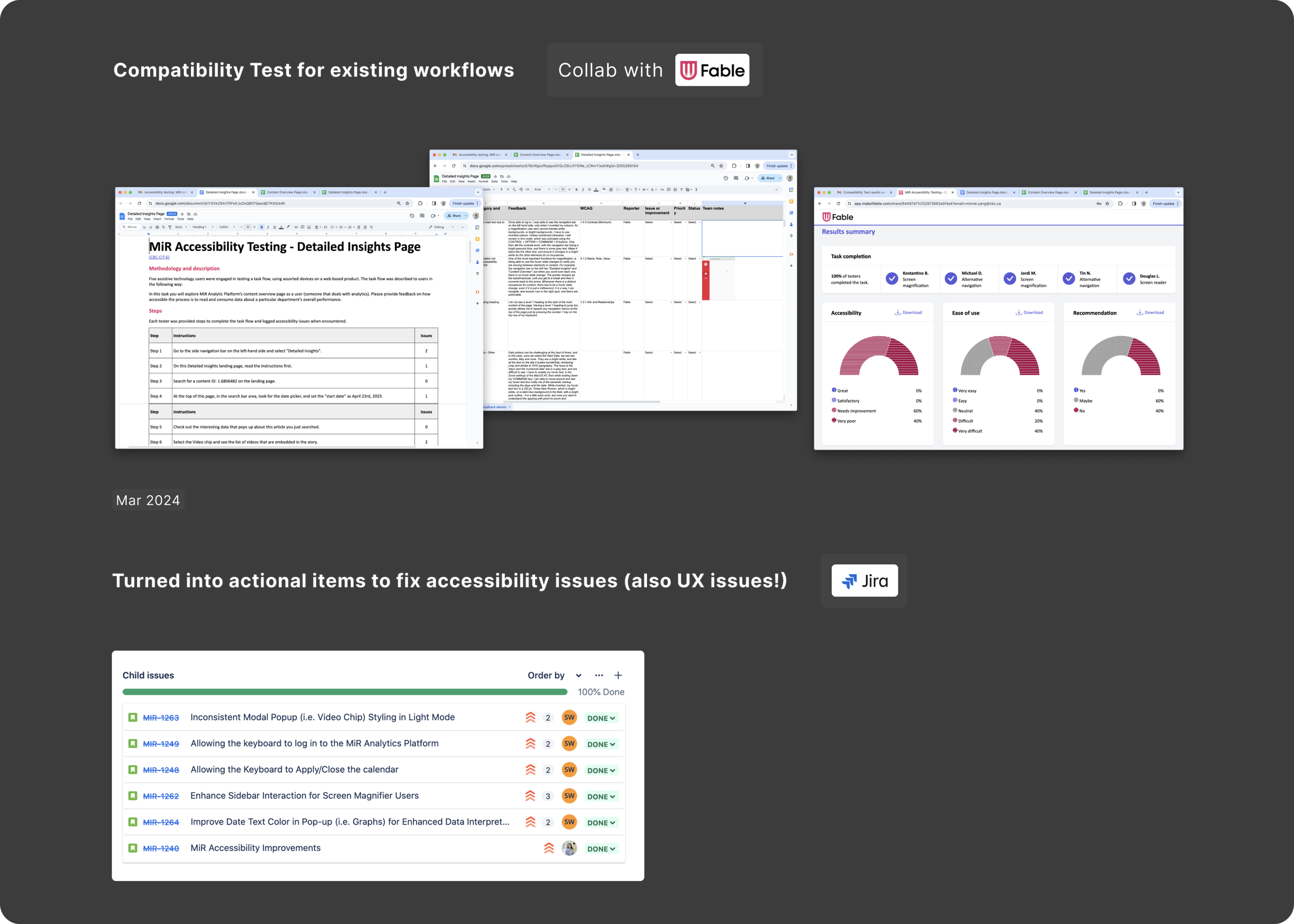
We partnered with Fable to do a compatibility test and identify issues before introducing new workflows.
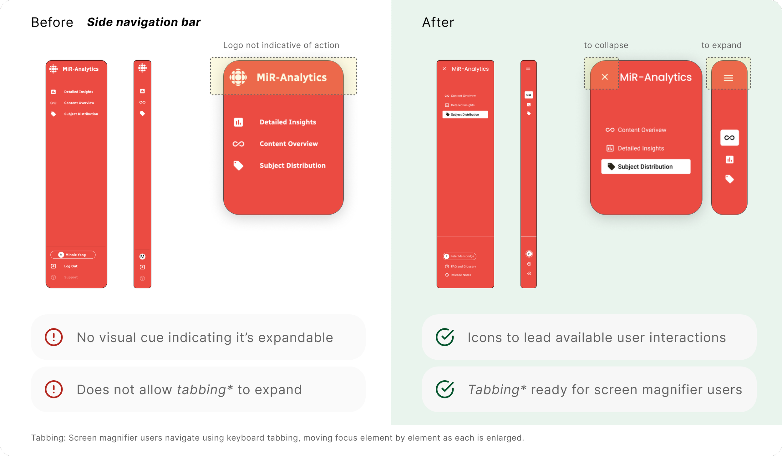
An example of before vs after accessibility adjustments:
Moving Onwards
On regular basis, I work closely with our Accessibility team to ensure UI and interactions are inclusive from the start, avoiding future structural changes.
Delivery Highlights
1 · Unified Design Language
Using MUI 5.14.0 as our base, we retained most UI specs, adjusting colors, component groupings, and interactive states. Each product has a unique, WCAG-compliant color scheme, but the design remains consistent, ensuring a cohesive portfolio aesthetic.
Component
Consistent and accessible design across component libraries. See below button as an example.
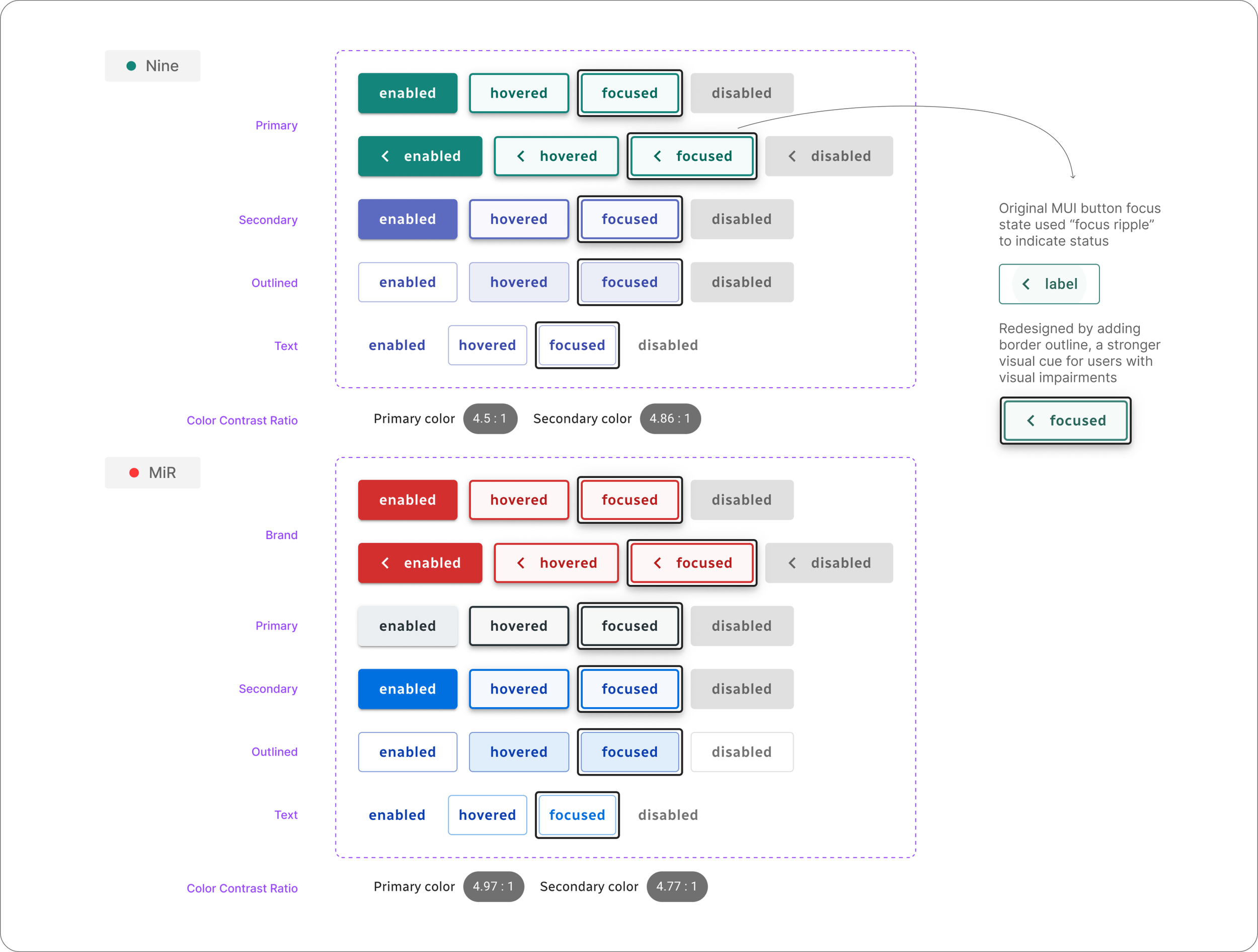
Alt text: list of buttons showing default, enabled, focused, disabled states, for both Nine and MiR, showing design consistency.
Layout pattern
Same applies to layout as both products share the same patterns: side navigation bar, and centred area of contents.
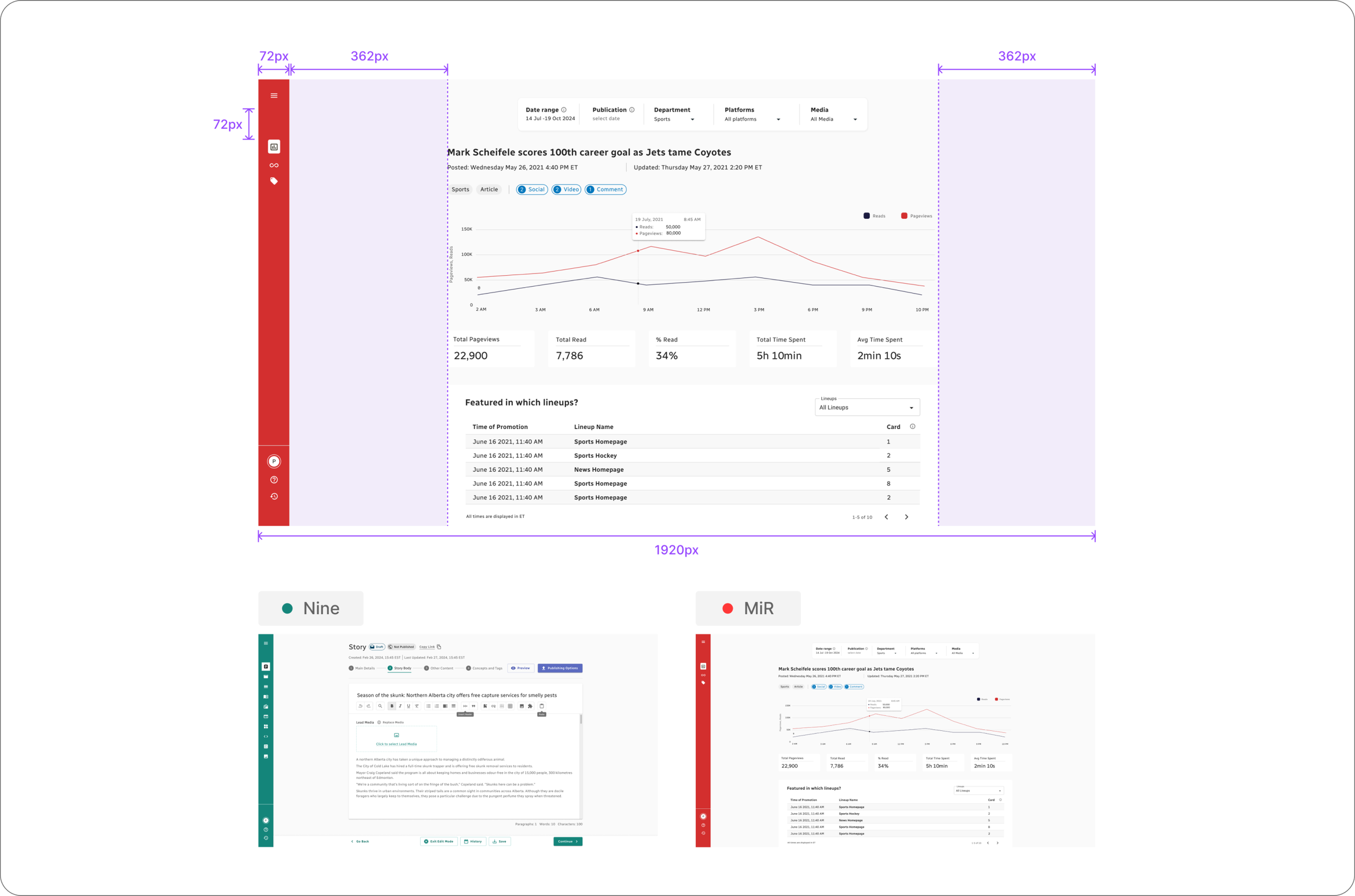
Alt text: Layout pattern of Nine and MiR with design specifications annotated in pixel numbers showing its standard and consistency.
Component Library
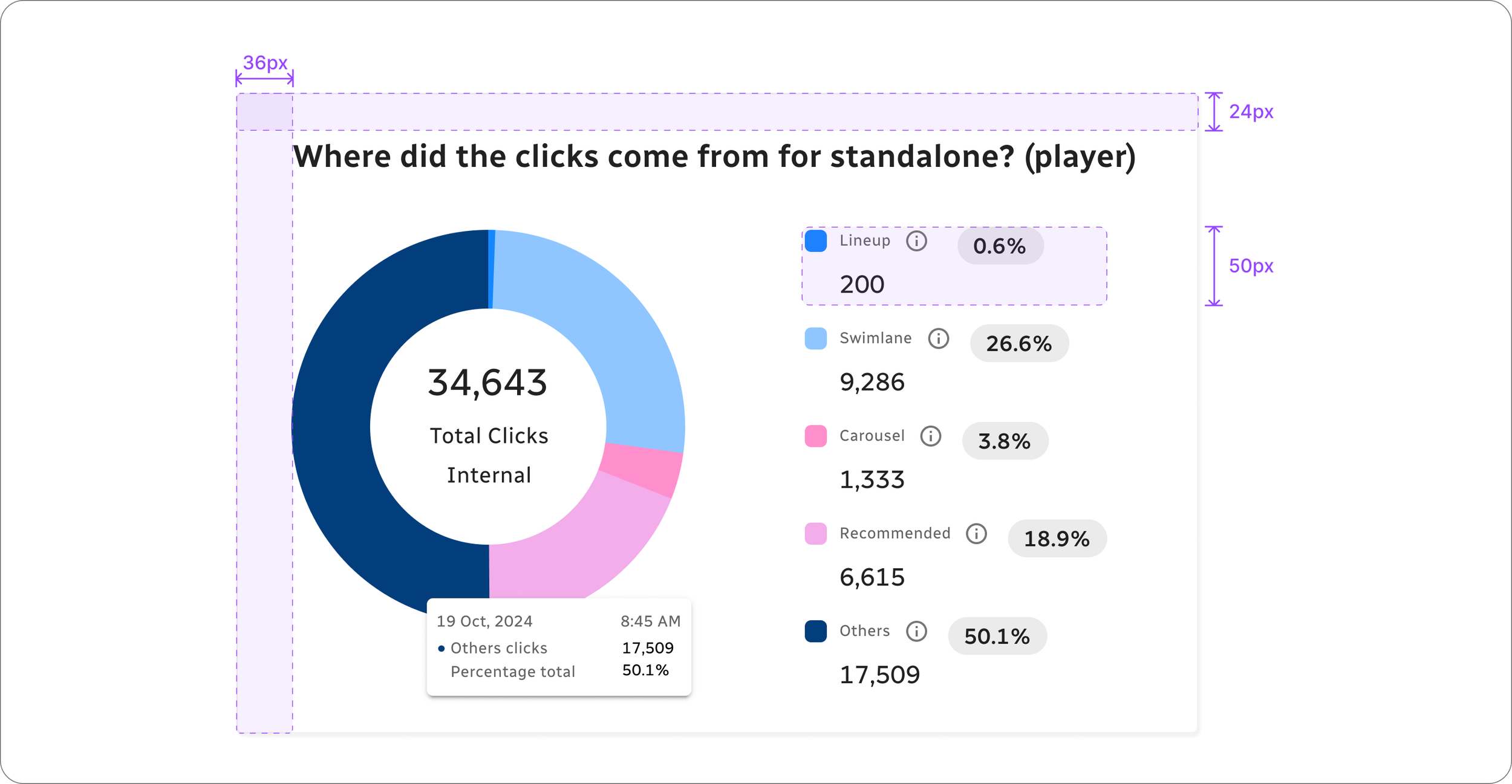
As new elements emerge from each product's design workflows, the component library expands. Example below is a donut chart I designed from scratch, following established layout patterns to ensure consistency across the product.
2 · Cohesive workflows
Navigation
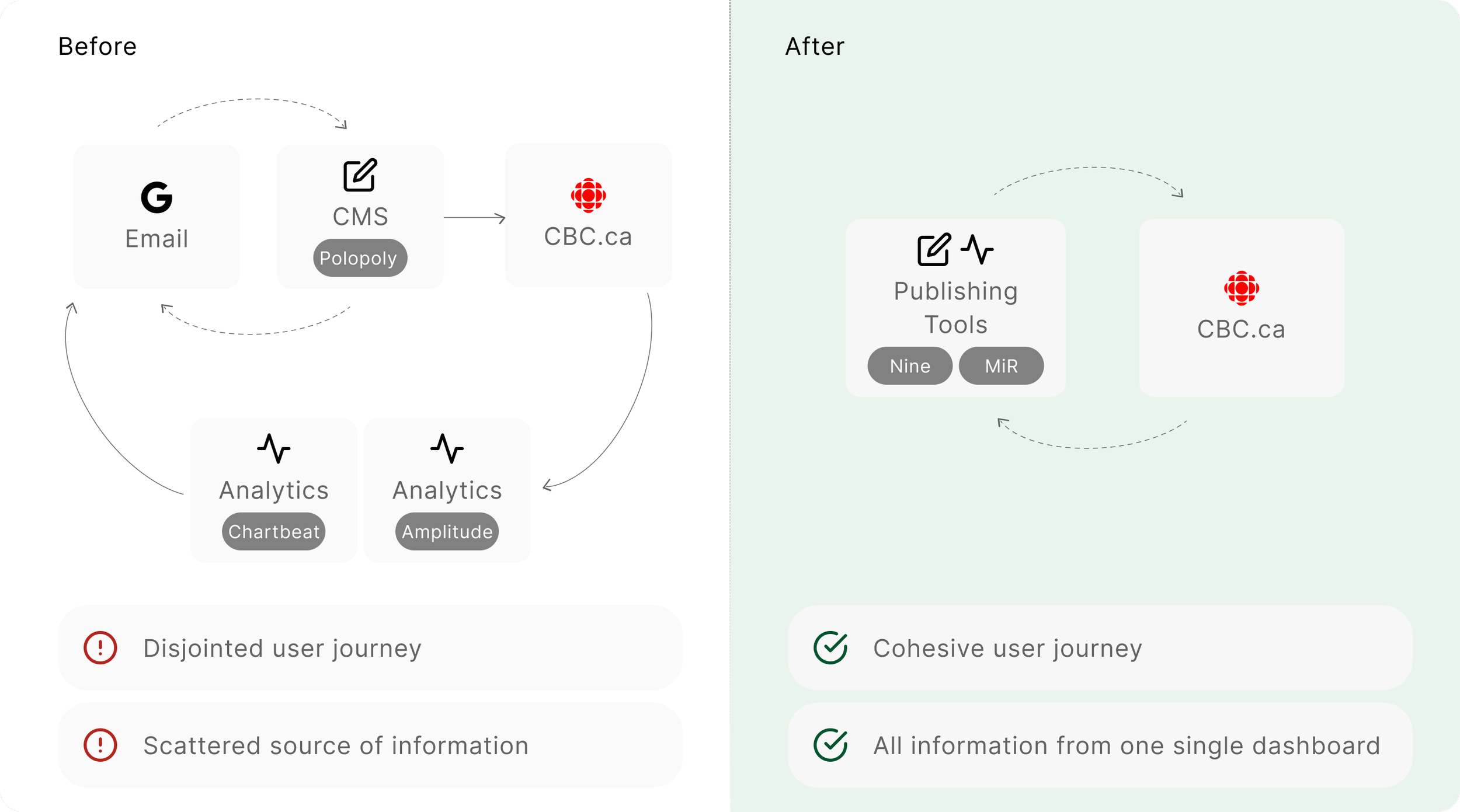
Previously, users switch between Gmail, Polopoly and MiR to publish and analyze contents.
Now, the streamlined workflow creates a more cohesive and accessible experience. Navigation takes only 1 step.
Design Showcase
MiR
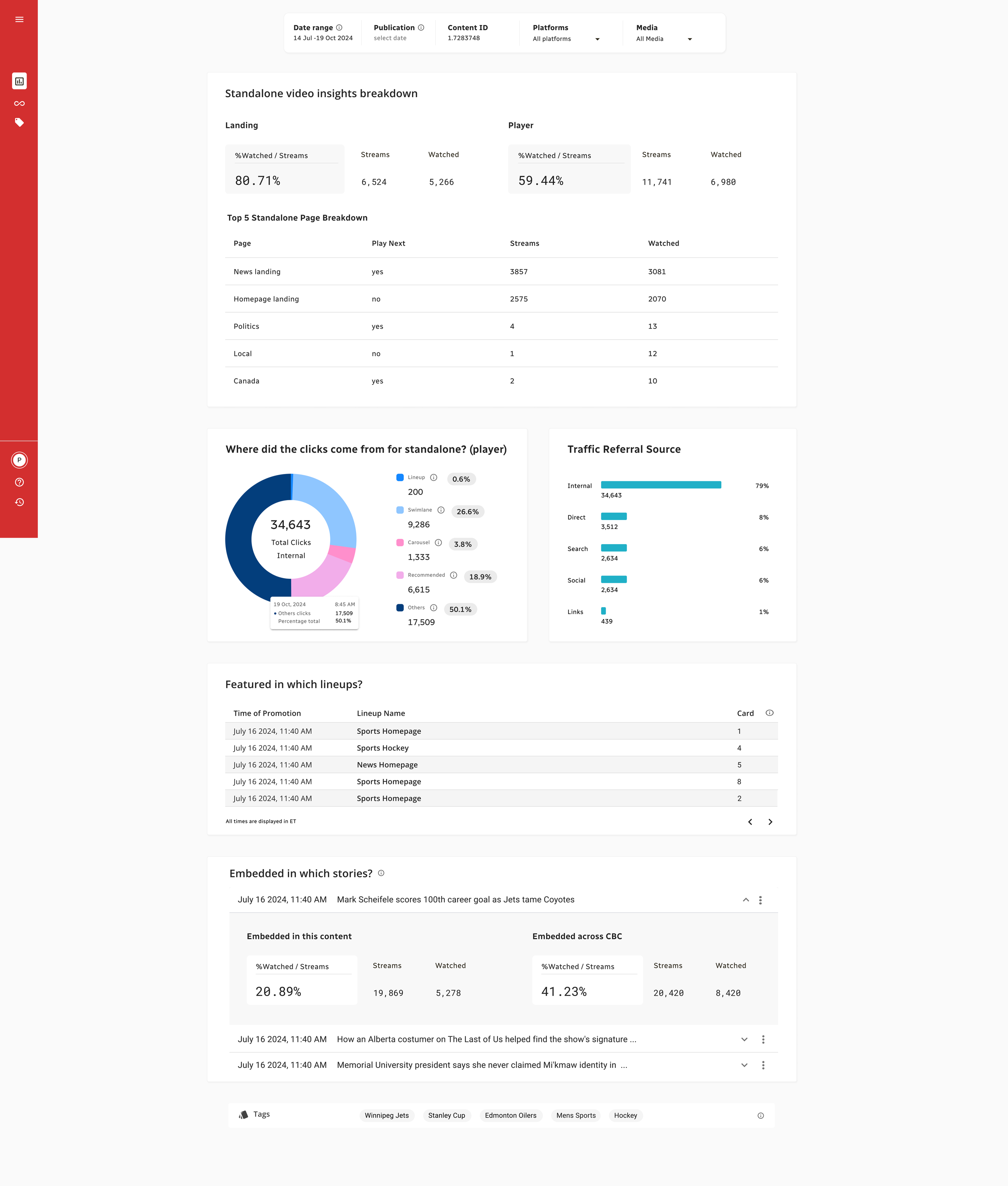
Example wireframe for Detailed Insights page. This shows users detailed insights of a video that they published on CBC.ca.
Nine
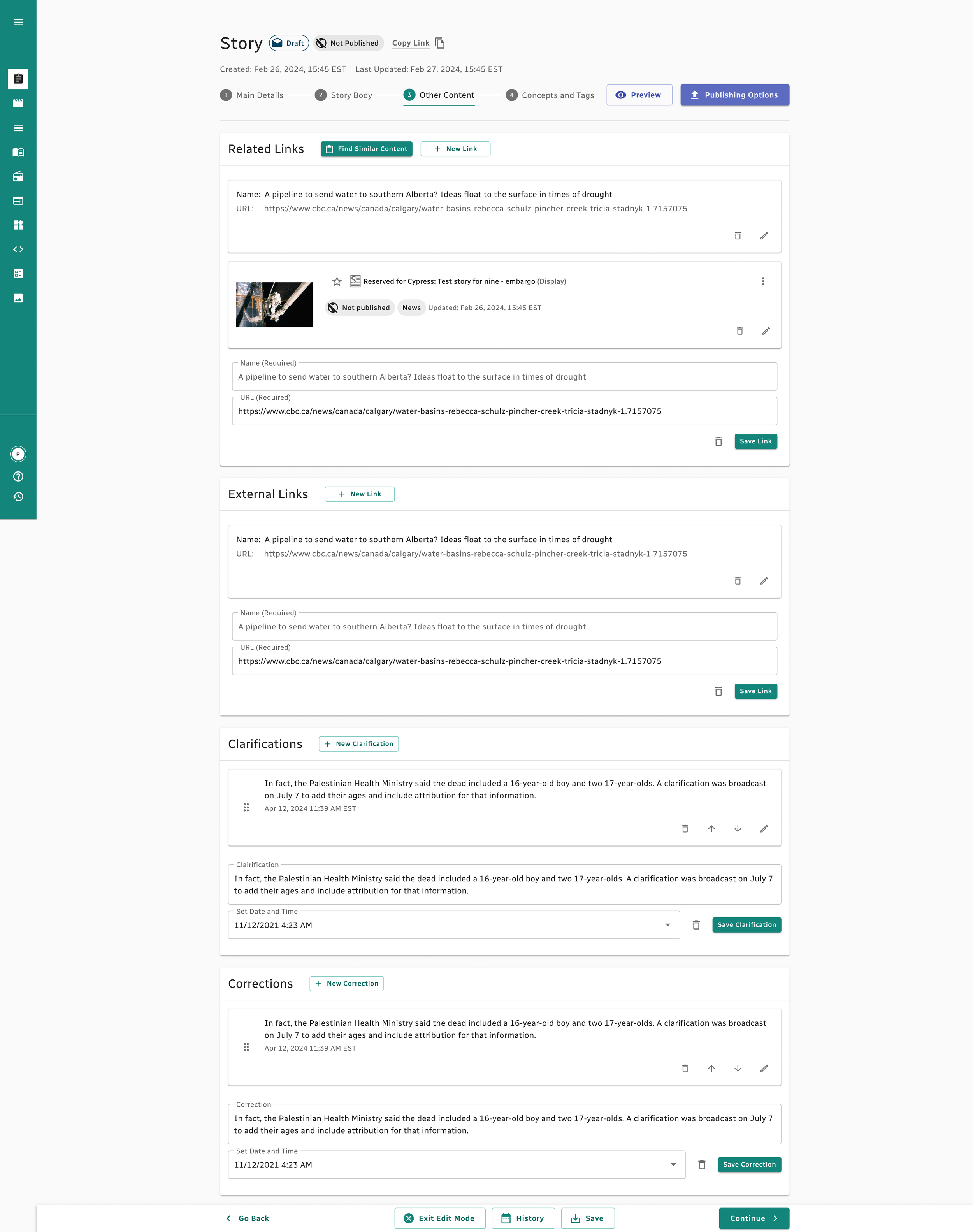
Example wireframe of Nine. This is co-design work with the other talented designer.
Products in motion (as of now)
Below are screen recordings of MiR and Nine in use. The designs are still a work in progress.
MiR (analytics platform)
Nine (content management system)
What’s Next
{WIP}
notes: Gen-AI.
Project Takeaway
Accessibility First
During the design revamp, I faced a dilemma between balancing accessibility and aesthetics. At one point, I suggested implementing an "accessibility toggle" or "overlay" that would allow users to switch to a more inclusive version of the design. However, I quickly realized that this approach wasn’t feasible—not only due to technical limitations but, more importantly, because true accessibility cannot be an afterthought. A design that isn’t innately accessible cannot be made fully inclusive with bandaid solutions.
Working closely with the accessibility team was invaluable, especially in a greenfield project where we had the opportunity to design with accessibility in mind from the start. This experience once again taught me the importance of embedding accessibility principles into the core of design.
Teamwork: communication has its procedure and pace
For a project as big as this one, there’s many teams involved: product team / data team for each product / accessibility team / producer team (users). To a certain extent, It may feel like everyone’s giving “comments”, and together they influence too much on our design which may hurt the integrity of a good UX design.
From the trial and errors I noticed that communication, when paced properly and in a curated order, can “protect” our design from being distracted, as well as improving efficiency of teamwork. In my scenario, when showcasing initial designs, we invite accessibility team member and product designer peers in the same room, that way the new design feedbacks are reviewed by accessibility team in a synchronized way.
Life at CBC